Bretzel Bakery
How do you scale
a food brand without
losing its soul?
How do you scale a food brand nationally without losing the craft, character and credibility that made it special in the first place?
As businesses grow, what once felt clear and distinctive at a local level can become blurred at scale. That’s where brand strategy, visual identity and tone of voice need to work as one system – aligning how a business thinks, speaks and shows up across every touchpoint.
The Context
For over 150 years, Bretzel Bakery had been a pillar of Dublin’s Portobello community, serving generations with honest, wholesome sourdough bread. But as the business expanded across Ireland, supplying supermarkets, cafés and retailers nationwide, the brand hadn’t kept pace.
The Challenge
Our challenge was to help them build a brand system that could scale with the business. Despite wide distribution, Bretzel remained largely unrecognised. At the same time, inconsistent packaging, café branding and messaging meant the brand appeared differently at every touchpoint. As the category filled with mass-produced “sourfaux” alternatives, Bretzel needed to step forward as a clear, consistent and recognisable national brand, without losing the craft, credibility and quality that set it apart.
The Insight
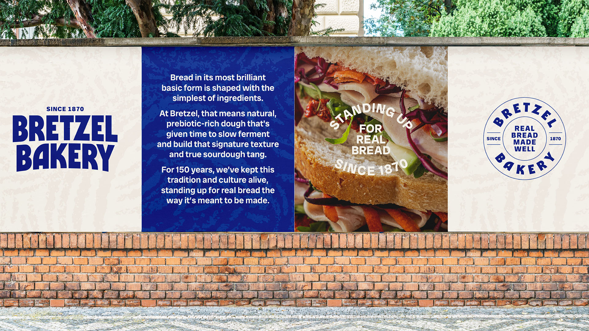
What scales is what you stand for. And to create a truly ownable brand, we looked beyond products to principles. Bretzel had always stood for real bread, made with artisan standards, quality ingredients and passionate people. That became our foundation. To build a brand story centred around their discipline and dedication to the craft of making real bread, really well.
The Strategy
We repositioned Bretzel around a clear, ownable idea. Real bread, made well. Moving the brand away from competing on price and into a premium position defined by process, quality and principle. From there, we clarified the role Bretzel needed to play as it scaled. Not a local artisan bakery, but a national bakery brand with craft at its core. One that could operate confidently across retail and wholesale, without losing credibility.
We restructured the brand architecture to align B2B and B2C audiences under a single, coherent proposition. This ensured the brand could show up consistently across supermarkets, cafés and direct channels without fragmentation. We also defined the core brand pillars that would guide every decision as the business grew.
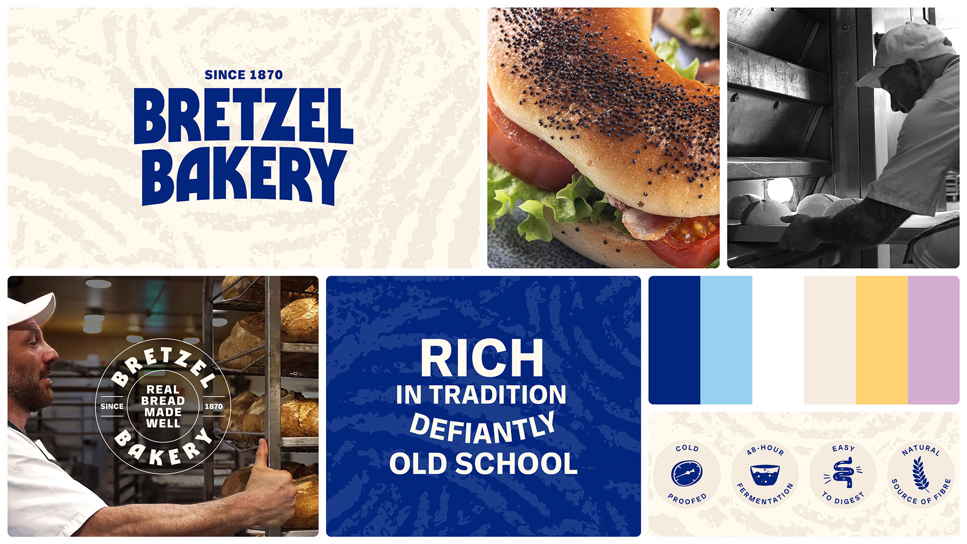
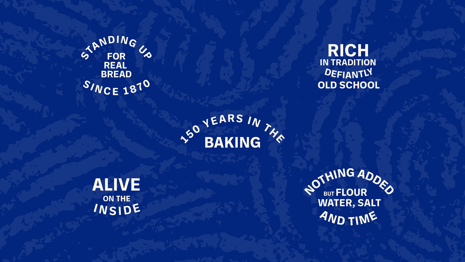
The Tone of Voice
The tone of voice was designed to express the new positioning consistently across every channel. To shift the conversation from price and convenience to process, giving Bretzel the language to stand up for quality in a category driven by shortcuts. Wholehearted, grounded and quietly bold, the voice builds trust, educates customers and works as hard in retail as it does wholesale.
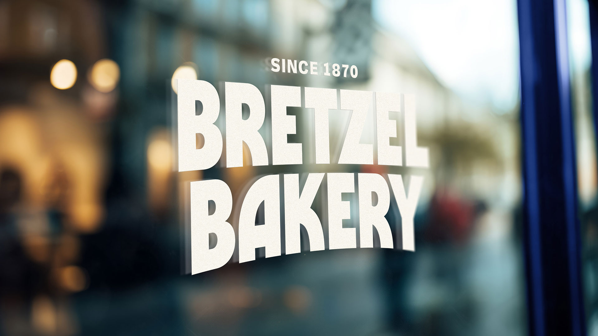
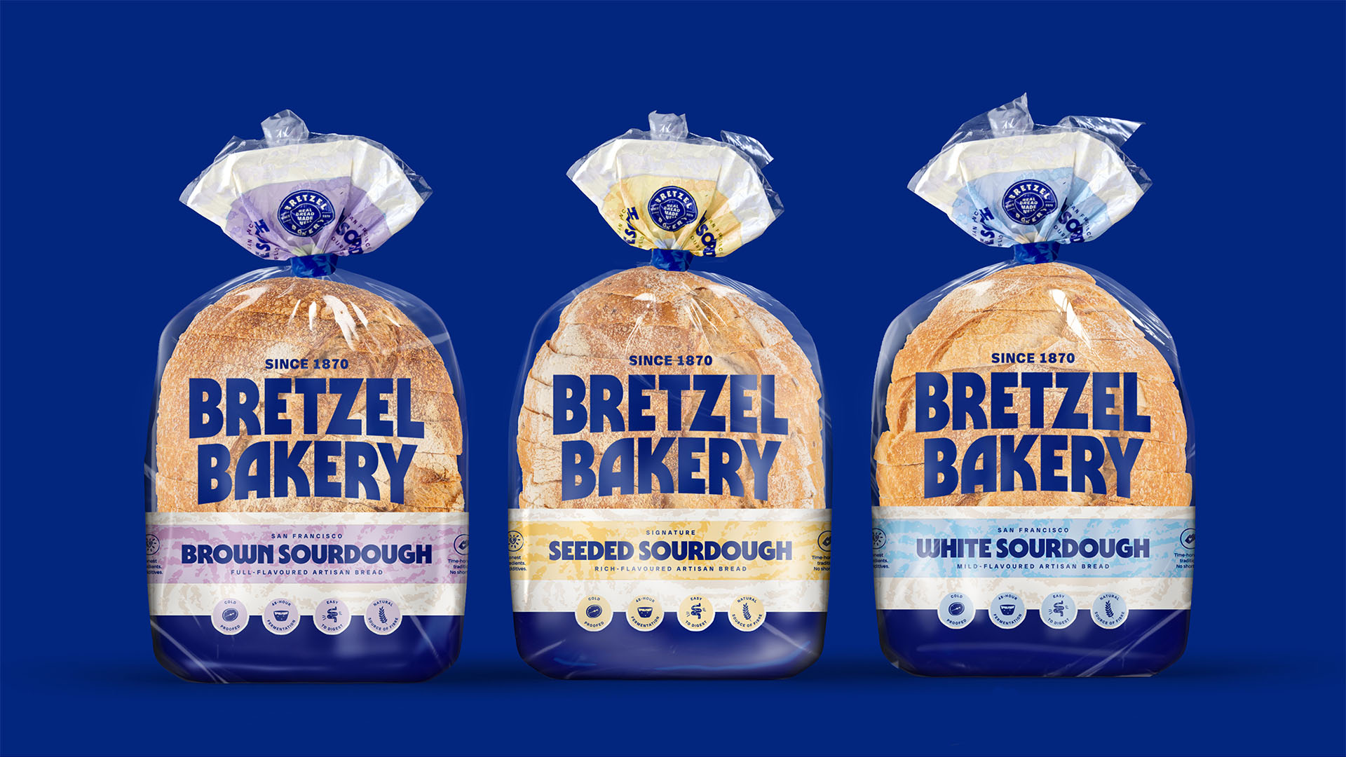
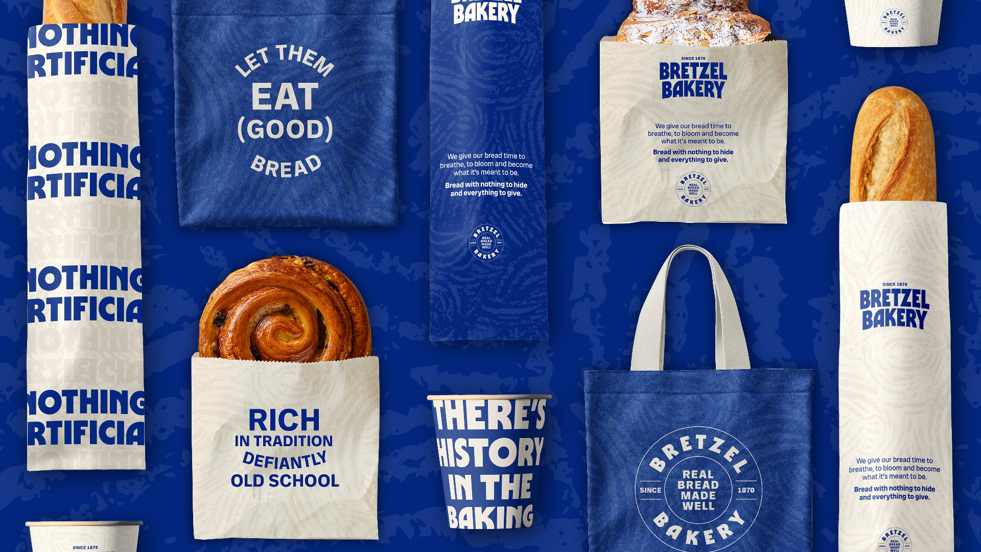
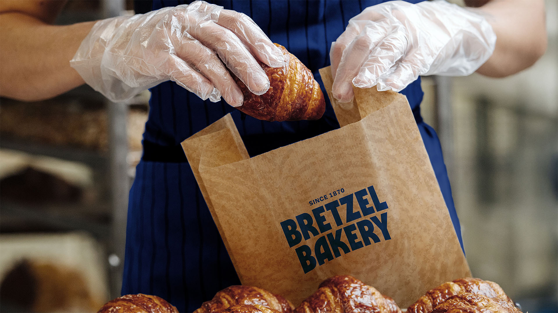
Visual Identity
To support scale, the visual identity moved from fragmented to unified. We created a cohesive system across packaging, café and retail, anchored by a new logotype that signals confidence and leadership.
The introduction of Bretzel Blue, a nod to the acquisition of Arbutus of Cork, established a new, distinctive and ownable asset that cuts through typical category beiges and burgundies. The result is a clear and consistent identity that strengthens recognition on shelf and supports a more modern, premium position.
Impact
Bretzel is now a brand built to scale. By aligning strategy, identity and voice, it shows up as one unified system. Unmistakable in any setting across Ireland, whether a local bakery, a supermarket aisle, or a café counter.
Recognisable, consistent and grounded in principle, it stands out in a crowded category while staying true to what made it special 150 years ago.