Debra
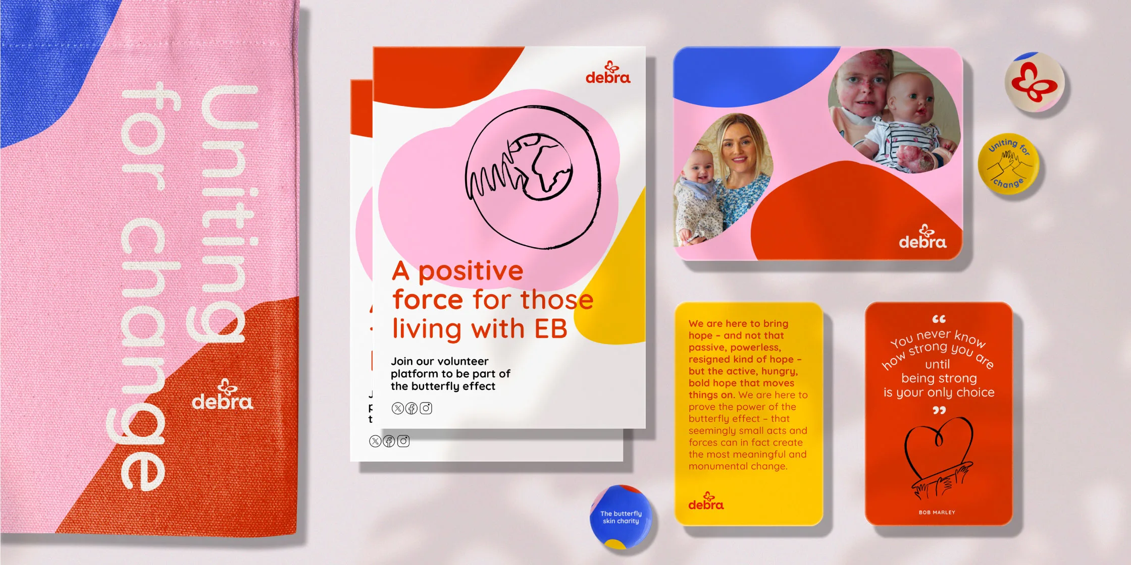
Uniting for Change
Creating a brand of bold hope for everyone with skin as fragile as a butterfly wing
Developing a refreshed, compelling and thoughtful new brand system for Debra, so they can continue to radiate bold, ambitious hope for everyone impacted by EB in Ireland.
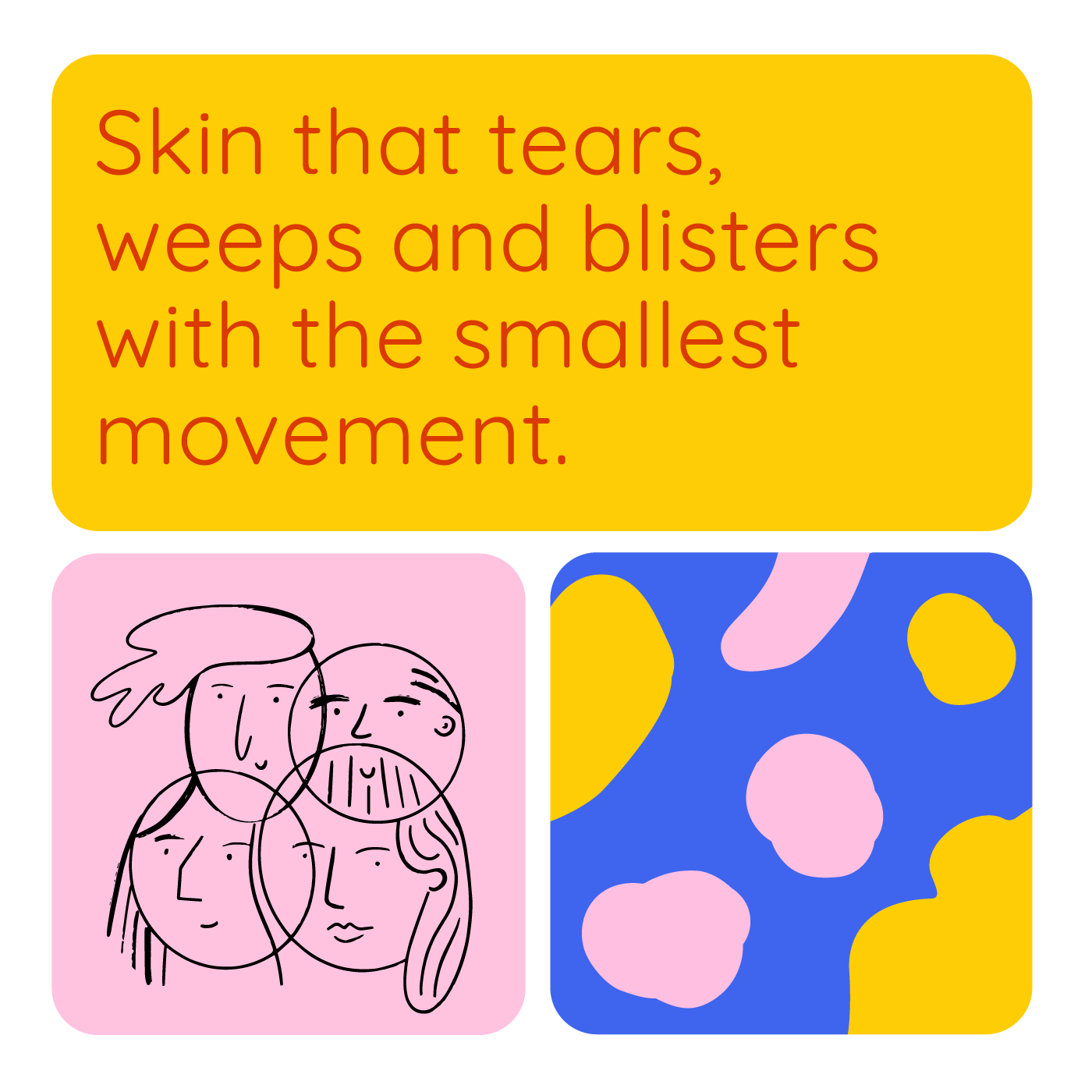
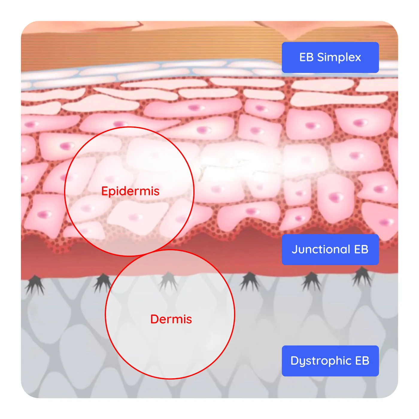
Imagine if your skin was as fragile as a butterfly wing. If it tore apart and split at the slightest touch. If your days were full of stinging wounds, blisters and debilitating pain. This is the distressing reality of people with Epidermolysis Bullosa, a painful and distressing genetic disorder that affects the body’s largest organ; the skin. There are no known treatments or cure. Debra is a national charity, set up by and here to support people and families living with Epidermolysis Bullosa. Wholeheartedly and passionately dedicated to increasing awareness of this agonising condition, they work tirelessly to transform the lives of people affected by EB – raising critical funds, boosting support and driving research in pursuit of a cure.
The challenge:
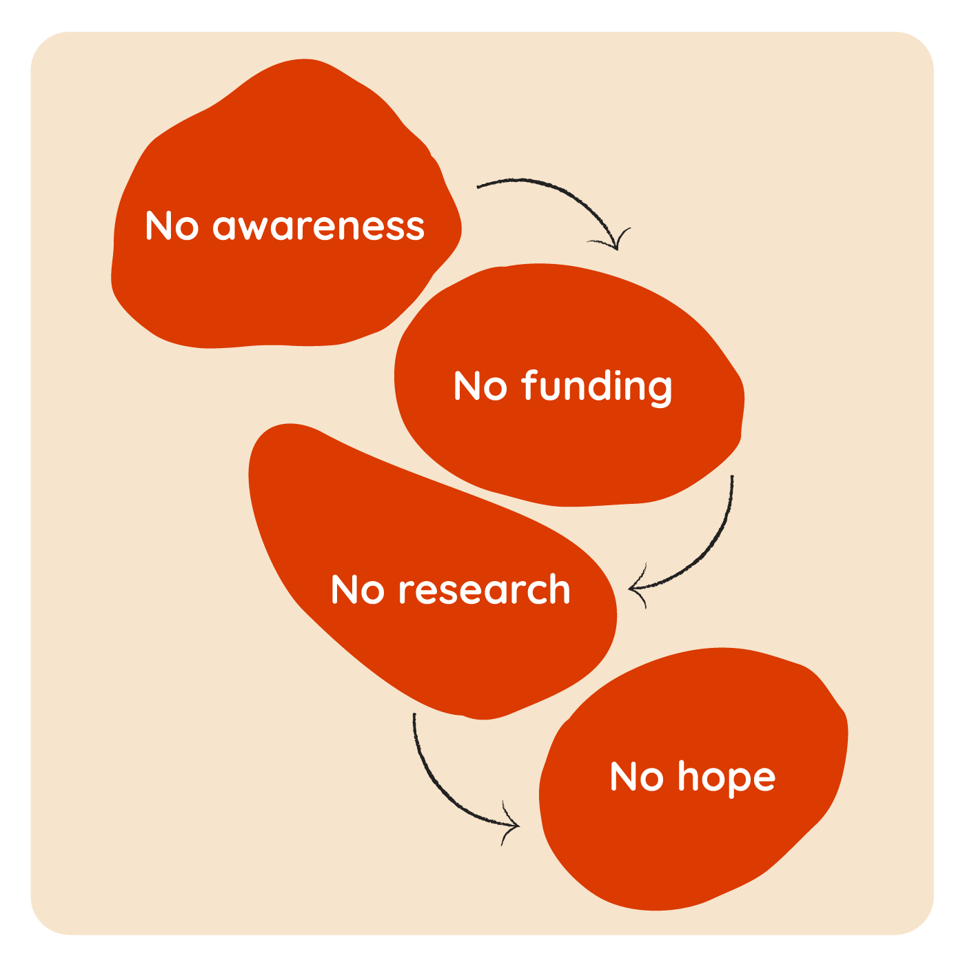
The key challenge was one of awareness. With little understanding of EB as a condition and a lack of knowledge of who Debra was, our objective was to create a compelling brand that would address this. A brand that would help raise vital awareness of EB and its devastating consequences, and help Debra boost their impact and chances of raising critical funding and support.
But beyond raising Debra’s profile and an understanding of EB in general, the brand also had another essential responsibility. It had to feel right and resonate with the families affected by the condition. Debra’s team works directly with EB sufferers and their families – offering free and confidential practical and emotional support. Support that is tailored to each individual set of circumstances. These relationships are a core part of what Debra does, and in many cases, have been nurtured over years and years, through very difficult times. There are deep, unbreakable bonds and real devotion on both sides.
The solution:
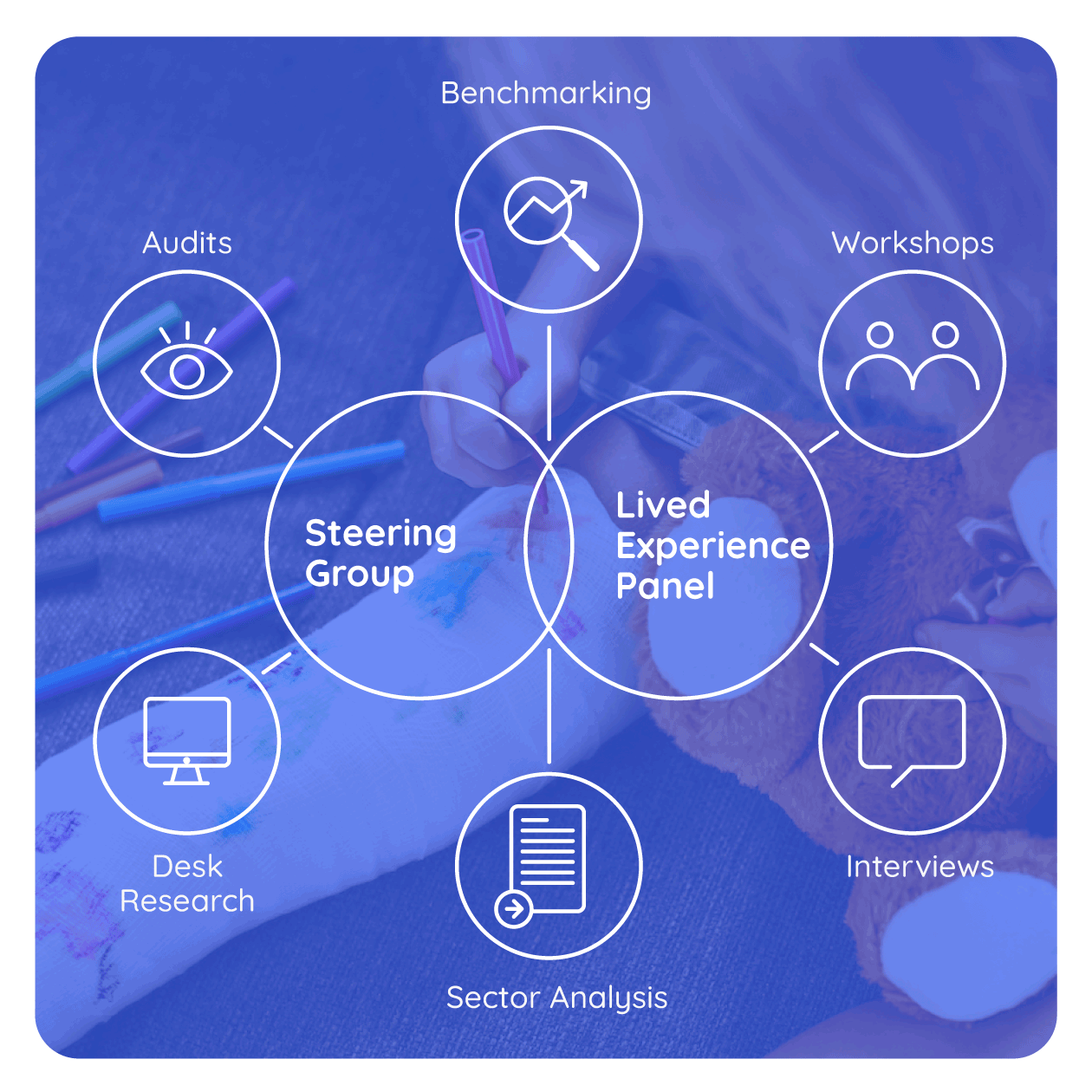
It was imperative that the solution resonated with families affected by the condition. We worked closely with them to understand their needs and wishes for the rebrand, gathering insights from their experiences and aspirations for the new identity. Our solution focused on aligning Debra Ireland closer to their international counterpart in order to boost recognition, while creating a new brand expression to establish a unique identity that aligned with their strong mission and values.
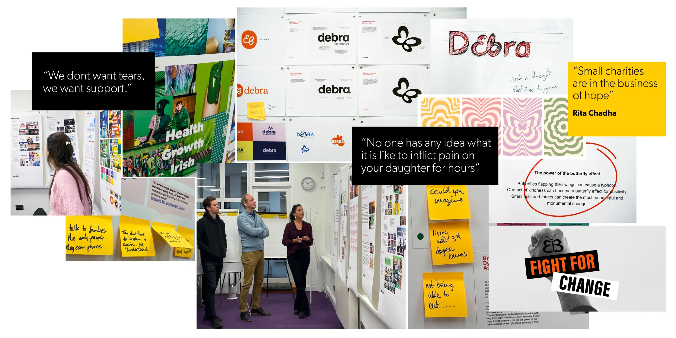
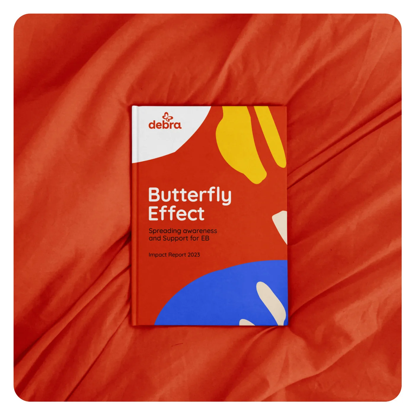
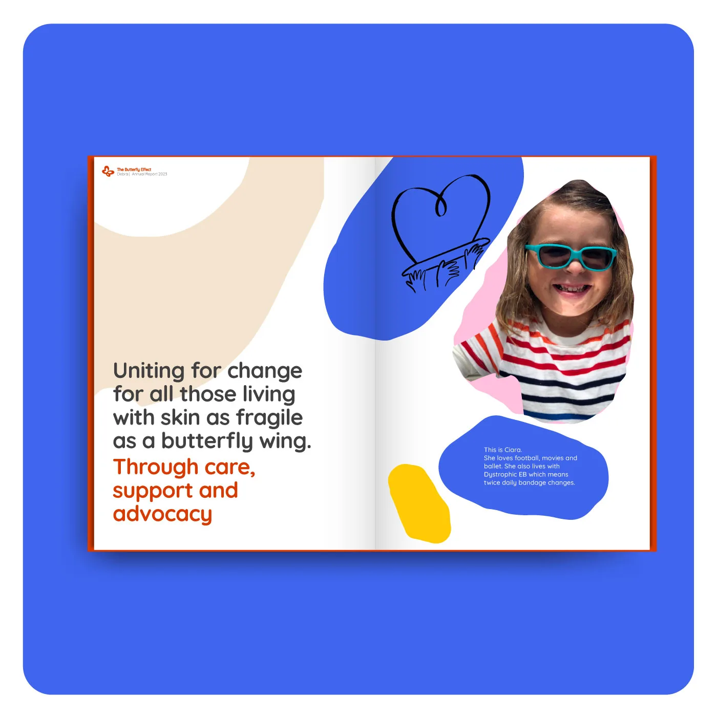
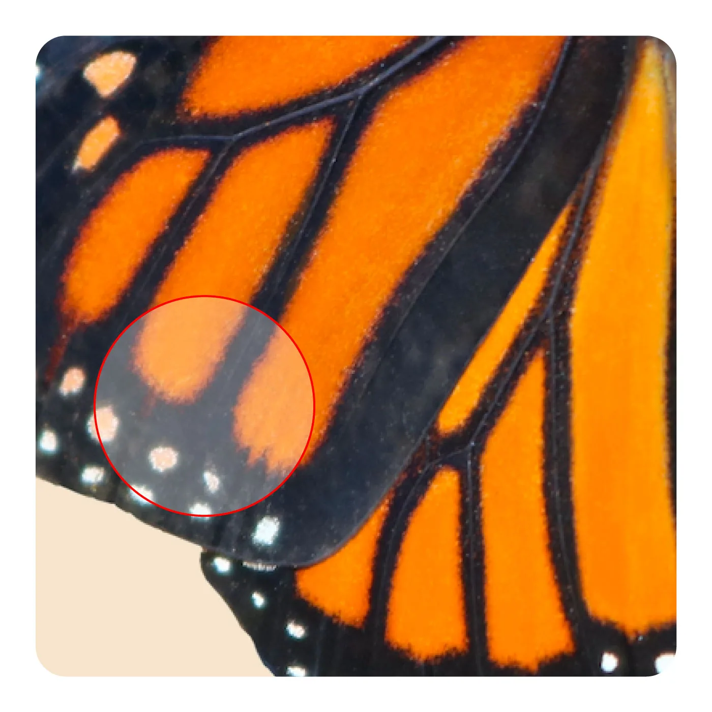
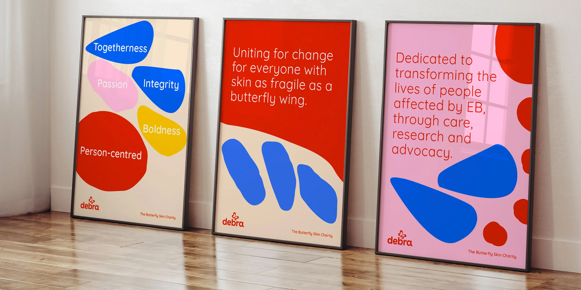
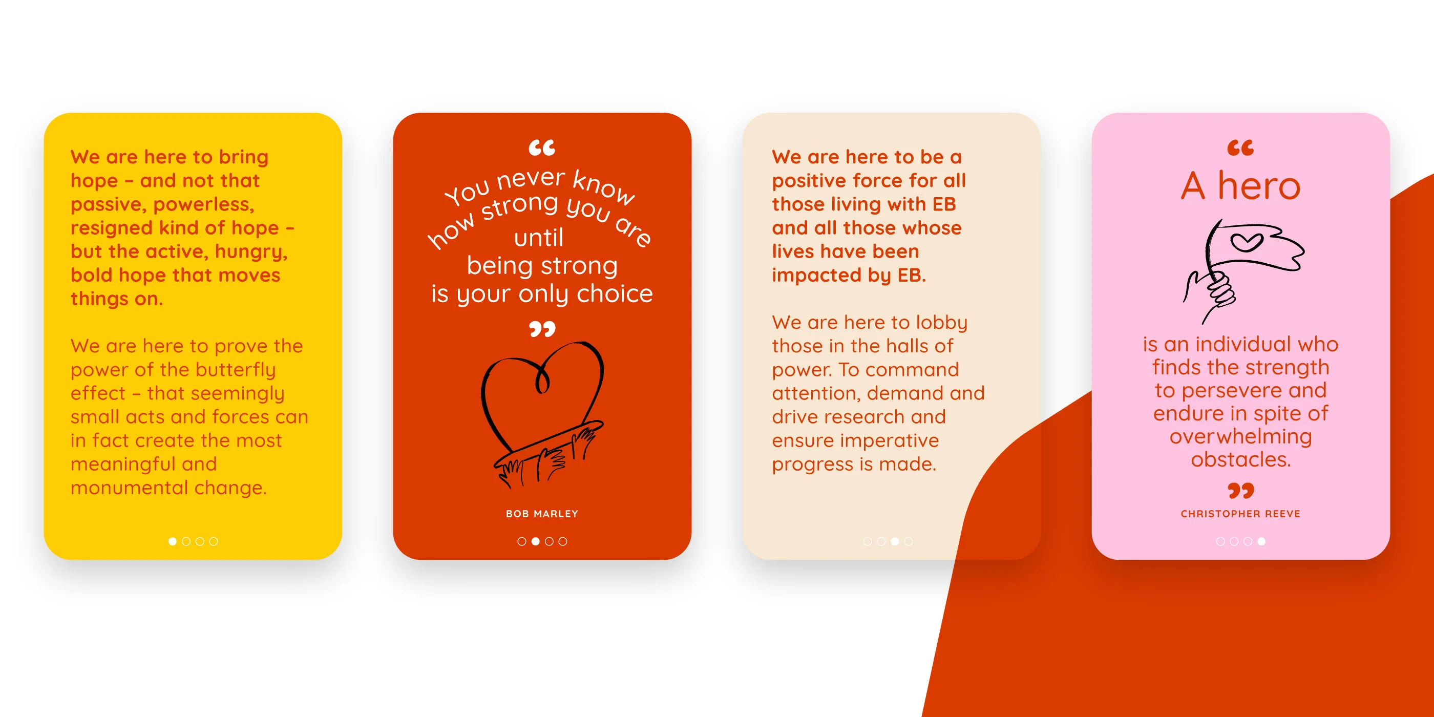
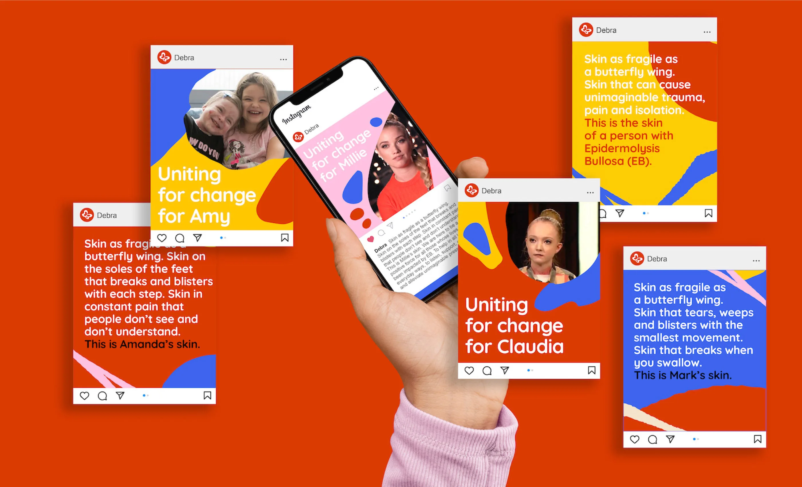
We began by developing a powerful proposition, “Uniting for change for everyone with skin as fragile as a butterfly wing.” This symbolised the extraordinary strength that lies beyond the fragility while also proving the power of the butterfly effect, that small actions can bring about monumental change.
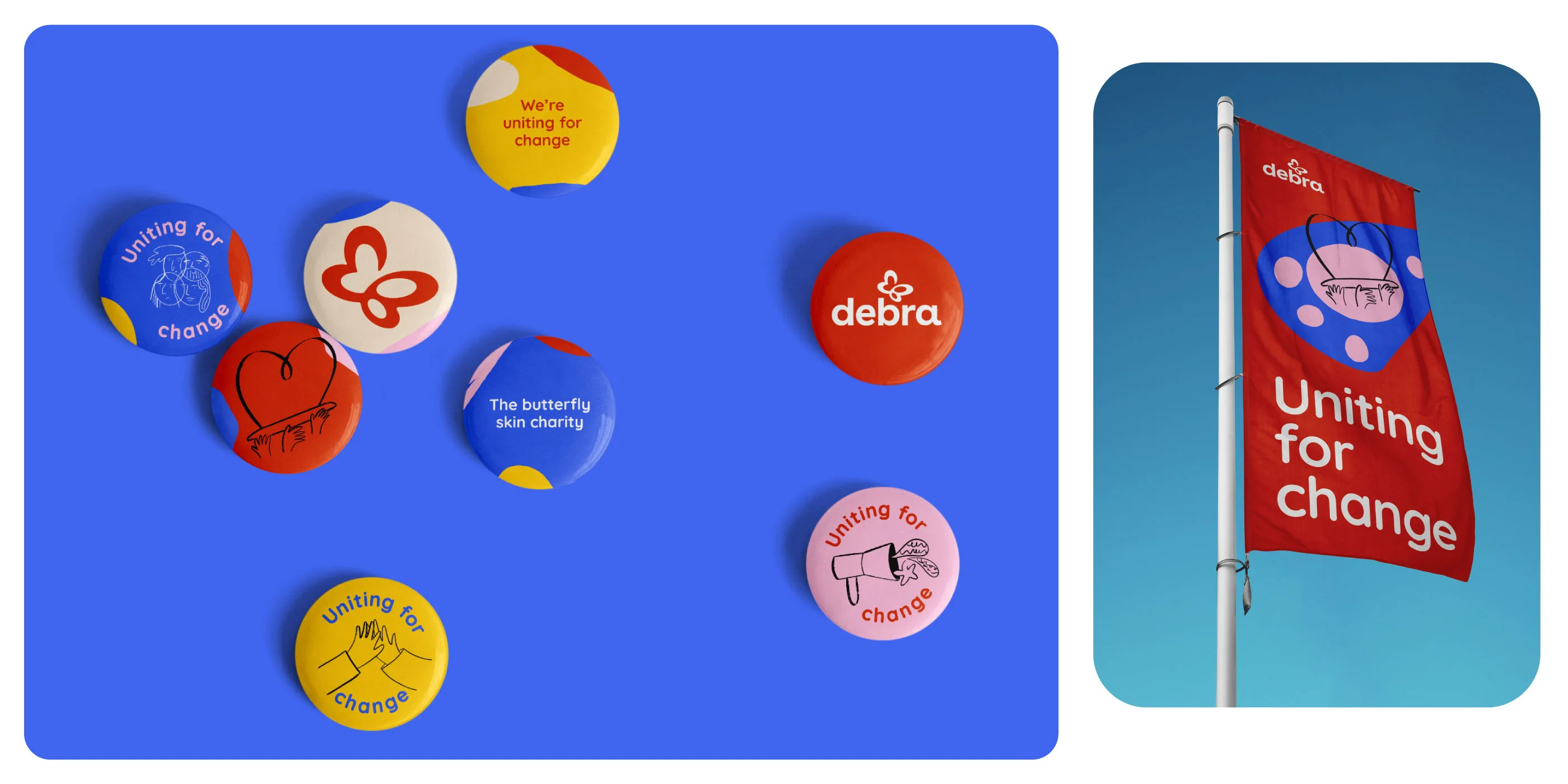
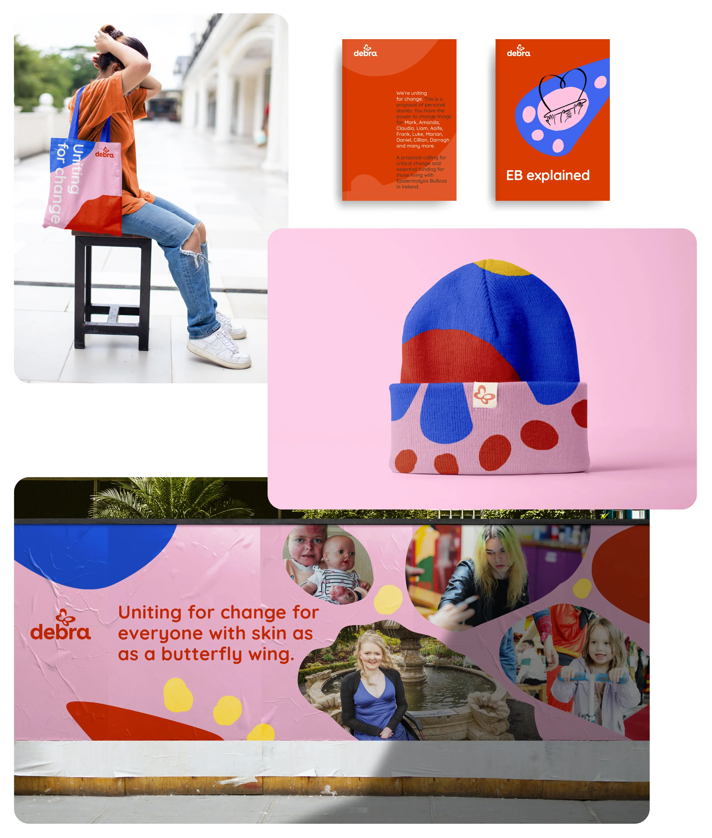
Underpinning our entire approach was one rule. Removing anything that could cause friction or irritation. That meant no corners or sharp edges anywhere. We redesigned the international Debra logo’s lower-case typeface, removing the sharp edges and redrawing the EB butterfly symbol to appear softer.
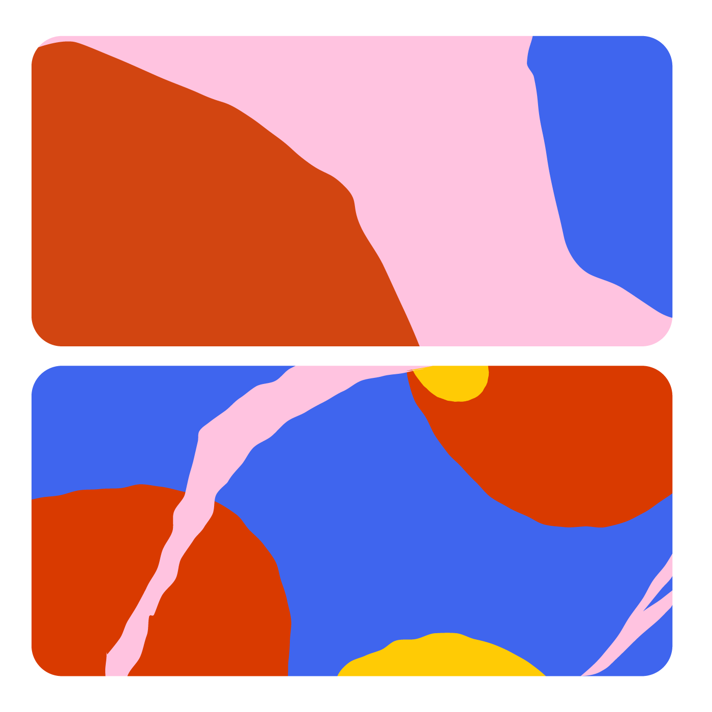
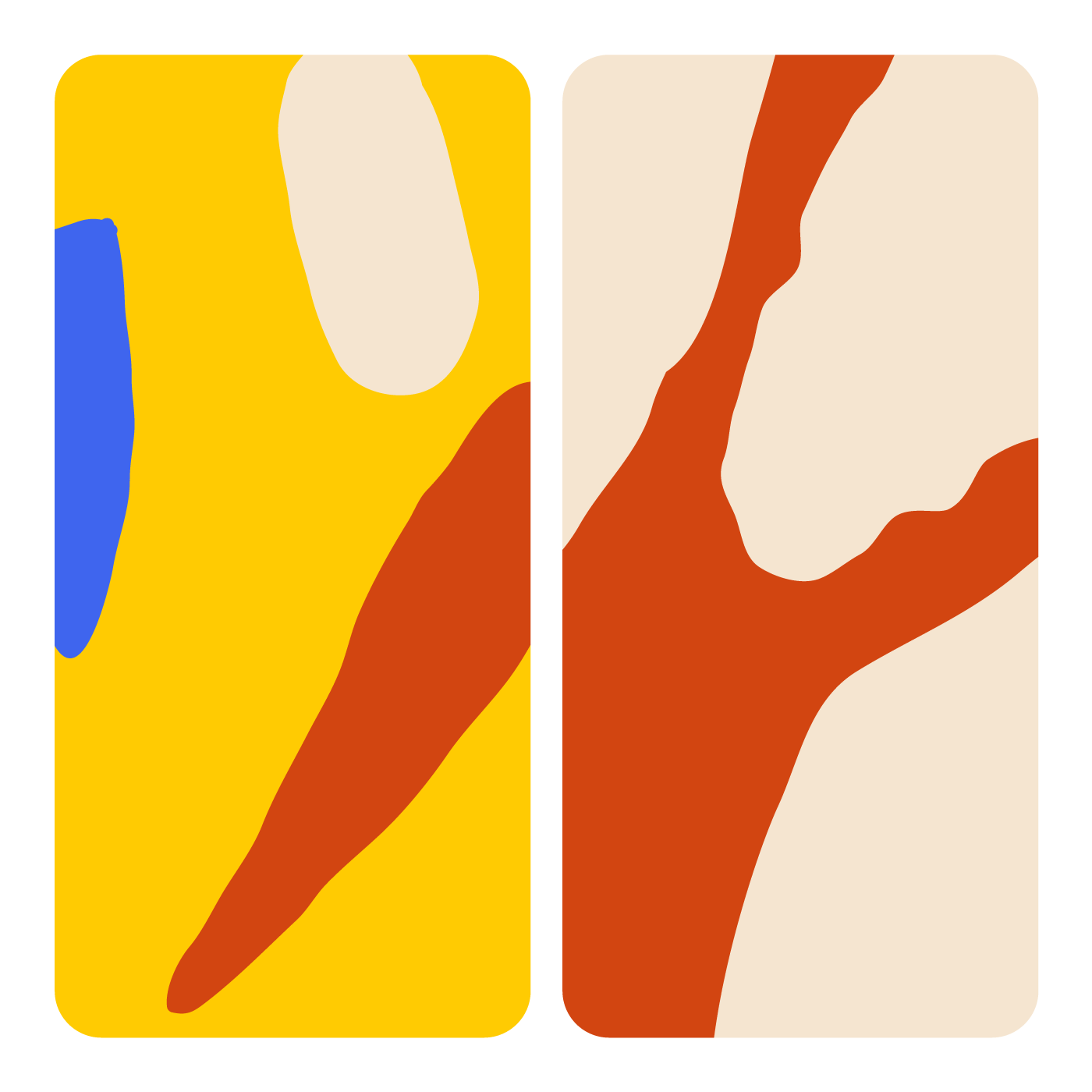
The updated identity was paired with a rounded open source typeface and a modern and energetic colour palette. A bold orange is the primary colour, supported by a vibrant palette of colours all selected from types of butterflies.
In the intricate forms and markings on butterfly wings, we found correlations to microscopic images of skin cells. We developed a series of brand patterns based on these intricate details and gentle shapes which injected energy, colour and life into the brand, making it an unmistakable characteristic of the new identity.
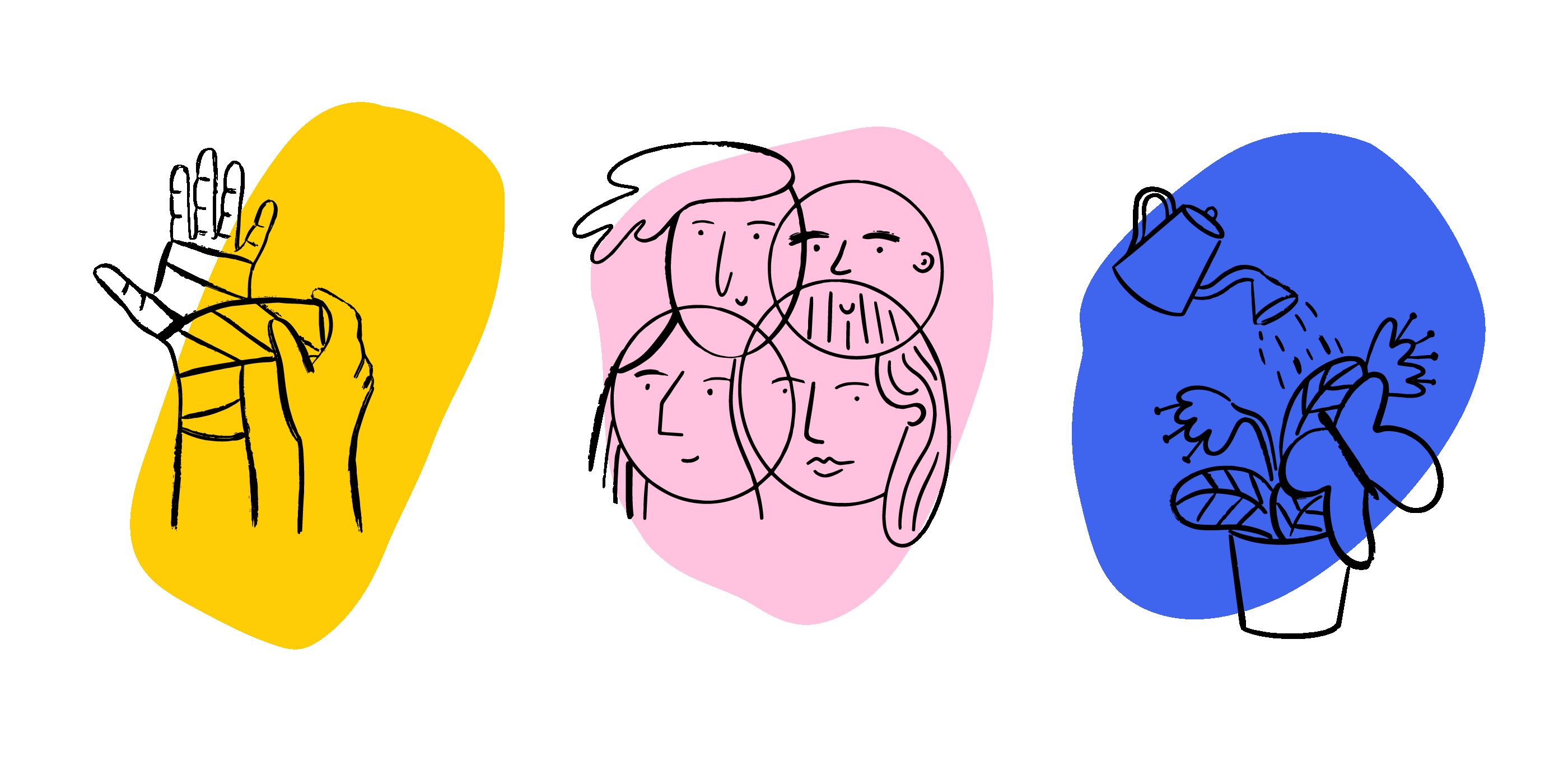
A bespoke illustration style was created that allowed us to compassionately convey topics where images may not be appropriate.
We developed relatable verbal guidelines to help Debra define their voice and speak to their various audiences. Telling the stories of those affected by EB is at the heart of what the charity does, so it was important to set writing styles that would help the charity amplify voices and reflect experiences with sensitivity and empathy. When discussing EB and the daily challenges it poses, the way a message is delivered matters profoundly. By having clear guidelines, Debra can be sure that future communications always strike the right tone and connect in meaningful ways with readers.
The Result:
In the end, we successfully brought Debra’s brand values to life through thoughtful illustrations, gentle typography and language that empowers and uplifts. The warm and caring visual system allows Debra to connect with its audiences, generating greater awareness of EB and supporting families in the day-to-day. Within three months of launch, Debra was, for the first time, chosen as a finalist for the Charity of the Year award.