doddl
Switching mortgage. It's a doddl.
Brand strategy, naming and visual identity for a new financial startup. Ireland’s mortgage market needed an independent customer champion, someone on the side of the consumer, someone to make it easier to switch, saving time and money for the things that matter most.
Brand strategy, naming and visual identity for a new financial startup. Ireland’s mortgage market needed an independent customer champion, someone on the side of the consumer, someone to make it easier to switch, saving time and money for the things that matter most.
Challenge
Over the past 10 years, people have become sceptical of banks and traditional lenders and when it comes to mortgages, consumers feel the banks always win. We needed to create a reassuring brand to launch Ireland’s first online mortgage switching platform. The brand needed to compel and convince consumers of how easy it is to switch mortgage and save considerable amounts of hard earned money. And what’s better is the service is completely free! With the lenders picking up the switching costs and a really simple process, it really is a doddl.
Solution
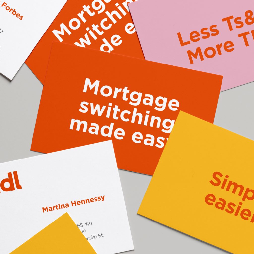
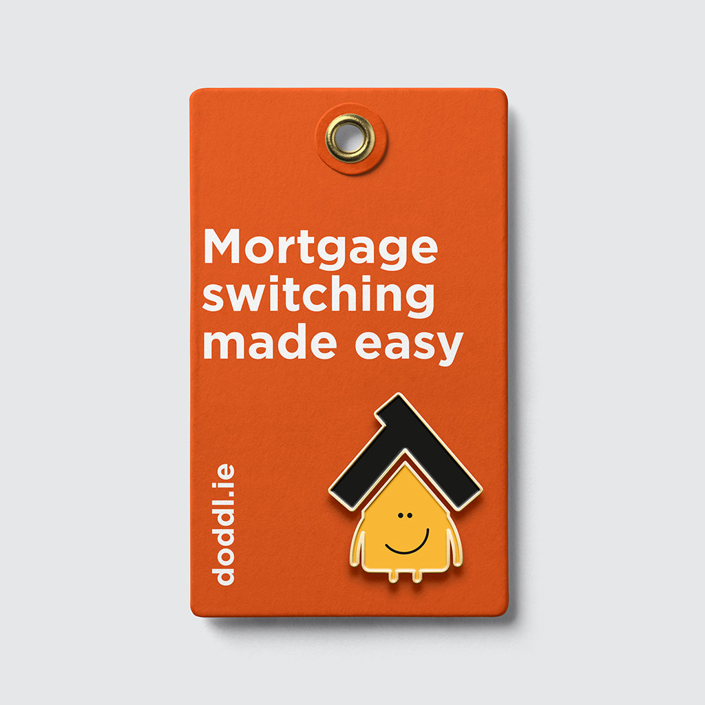
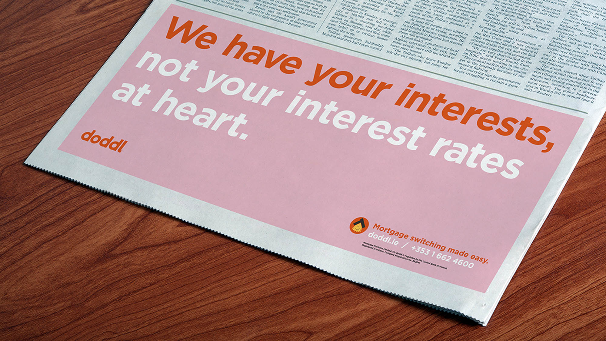
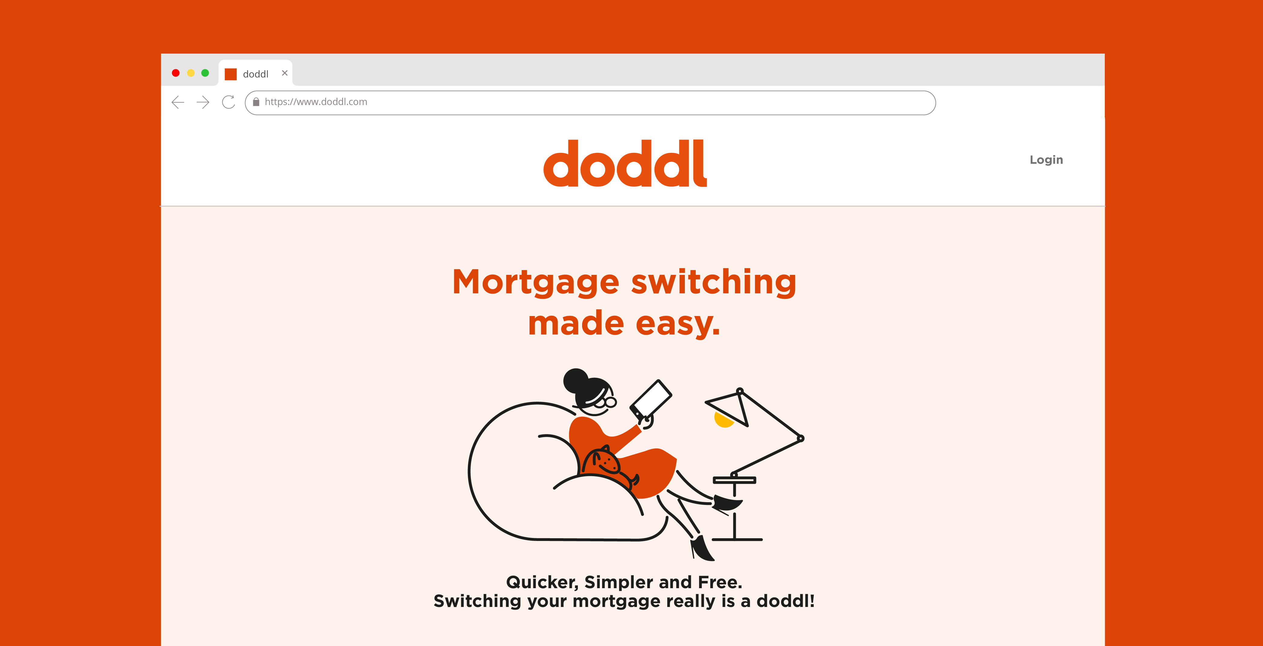
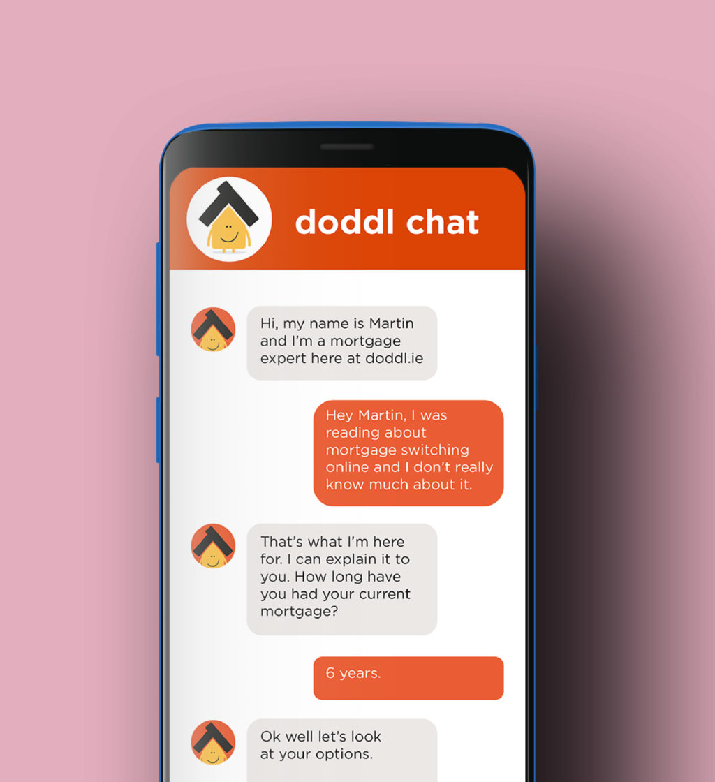
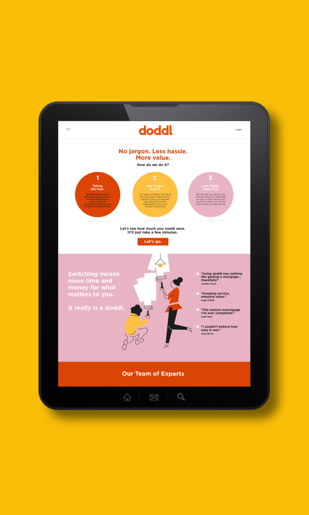
Switching mortgage involves none of the stress or anxiety associated with getting a mortgage first time around. It is a simple financial transaction that the doddl team partner you though. When it came to naming the brand, we focused on a name that communicated ease ‘it’s a doddle to switch’. And so the name was born. The supporting line explained to consumers what the online platform offered – mortgage switching made easy.
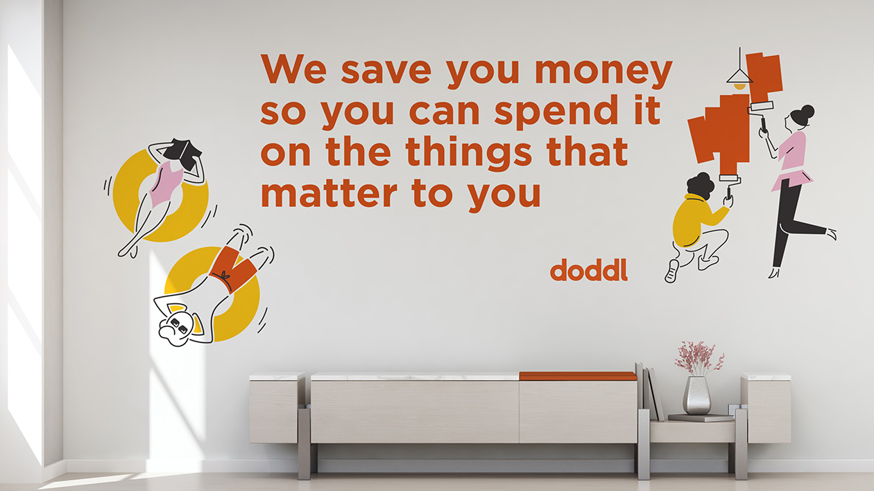
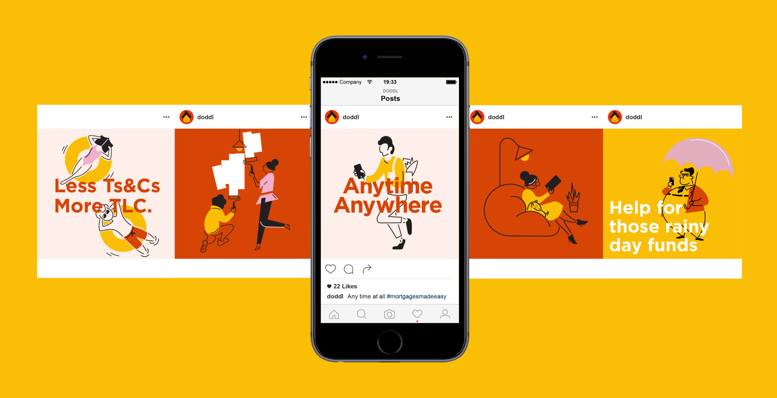
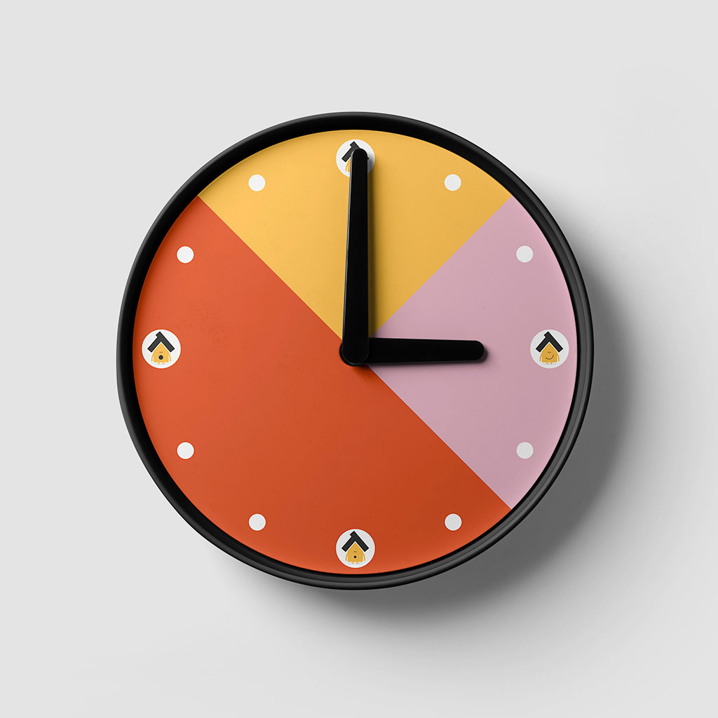
doddl is a new entrant for a new consumer era so we wanted the colour to reflect that, not the legacy financial services of corporate blue and signal red. We developed a bright and confident identity that stands out in the category, reflecting doddl’s values of openness and simplicity.
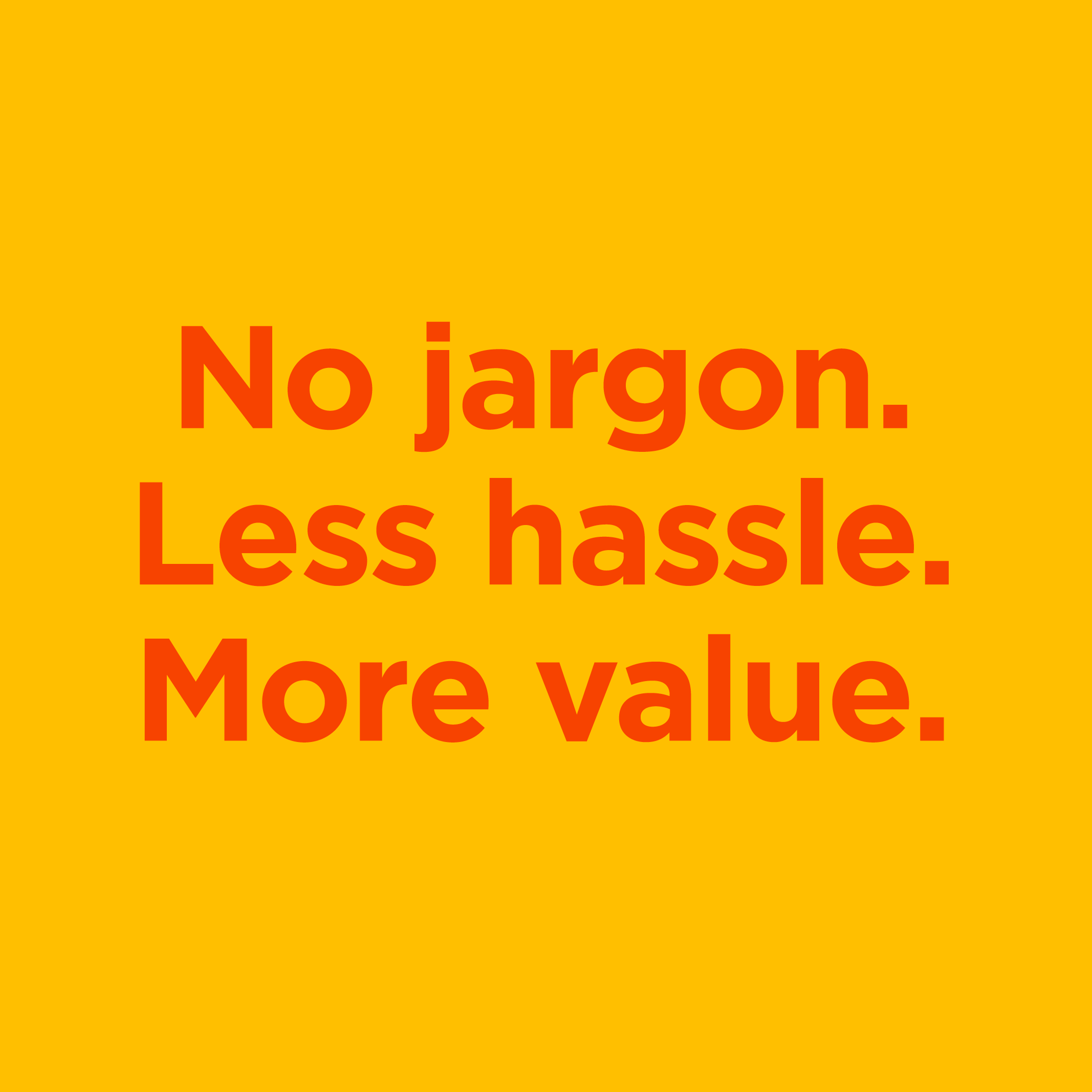
The tone of voice was a crucial part of getting consumers to engage with the brand. A disarming, consumer centric tone was used throughout the communications. ‘Think less T&C’s, more TLC.’ Our tone is authentic, down to earth and always helpful, simple and clear.
The biggest benefit of switching is the savings to be made. Rather than tell this with words, we used simple, organic, playful illustrations featuring a couple on holidays, travelling and renovating a spare room with the money saved. They convey both the ease of switching as well as the benefit it brings.
"We came to RichardsDee with a requirement to build a new brand that would reflect our vision for the offering we were bringing to market. RichardsDee immediately understood our vision and brought our brand to life. The quality of the creative meant that every meeting was exciting and the output of their thinking has resulted in a brand we are proud to bring to market and that stands out in our sector. We still love our name and logo today, as much as the first day we saw it. The team at RichardsDee showed professionalism, creativity and belief in everything related to our brand. They exceeded our expectations and it is for that reason we look forward to an ongoing relationship with RichardsDee."
Martina Hennessy, Managing Director, doddl