Institute of Directors Ireland
Positioning IoD Ireland as the
go-to network for ambitious leaders
Honouring the global roots of IoD Ireland, while building a distinctive brand system for the future
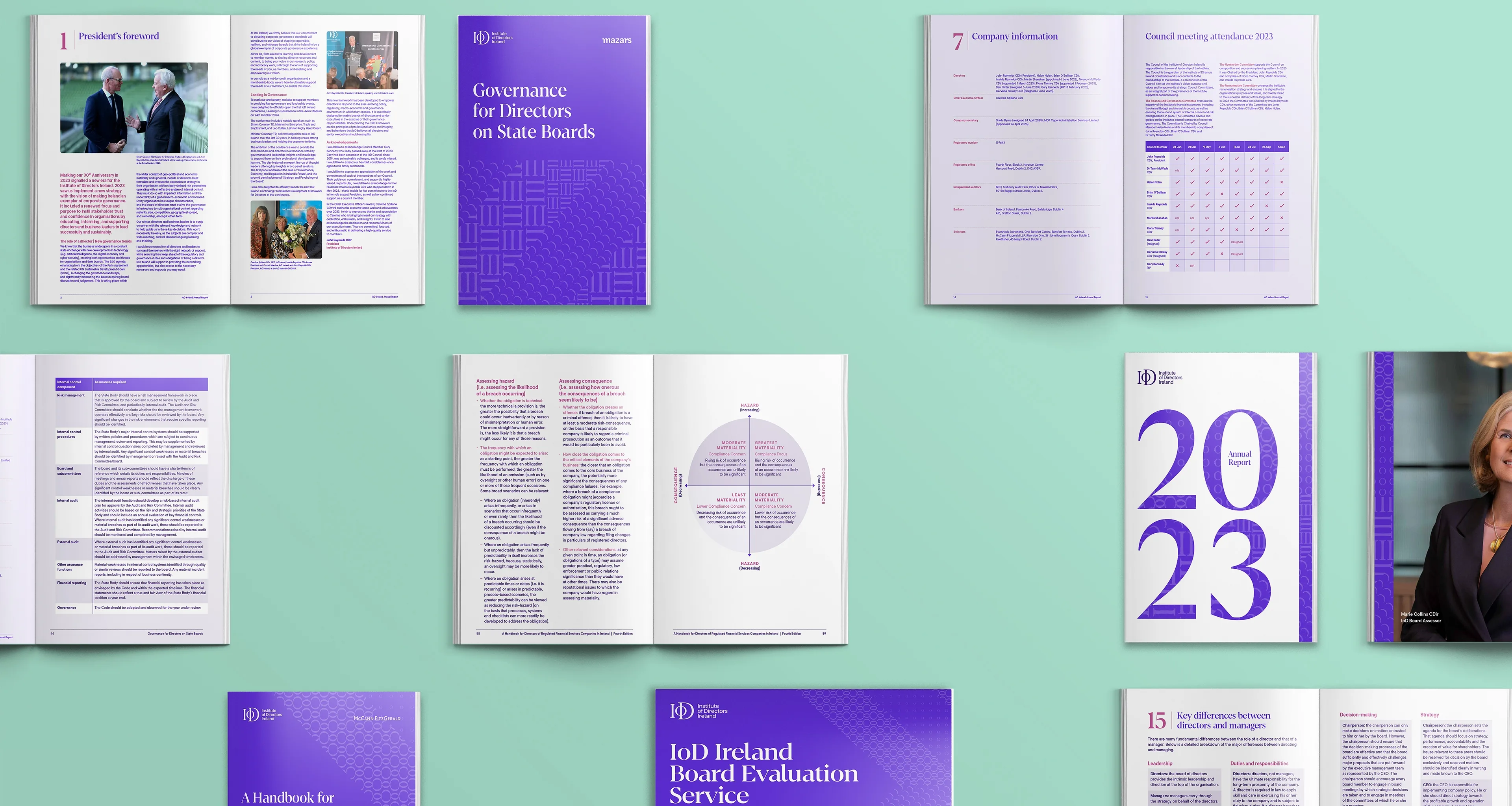
Through a revitalised brand system, our objective was to position the Institute of Directors Ireland as a brand known for its knowledge, expertise and inclusive network of leading business minds. We created a brand identity that championed IoD’s full capabilities while ensuring it felt authentic, sophisticated and member-focused.
Refreshed the brand system to reflect IoD Ireland’s global roots and future ambitions.
Elevated the four pillars of IoD Ireland’s CPD Framework through functional design and signposting.
Injected energy, wit and razor-sharp insight into their tone of voice to empower time-poor directors to become better leaders.

Background
The Irish branch of the global IoD brand has served as an authoritative voice, supporting aspiring directors, board members and seasoned executives to become better leaders through formal accreditations and chartered director training.

The Challenge
Since its inception in 1993, IoD Ireland has fast-tracked success for the brightest minds in business – however, the brand’s look and feel needed to evolve and flex with the times. With recent rebrands across the global collective, the organisation needed a gutsy revival that used tone and visual storytelling to convey its ambitious vision and premium services to time-poor directors.

The Solution
Working closely with the IoD Ireland team, it was clear they needed to retain the respect and loyalty of long-standing members, but there was also a desire to differentiate from the global collective.
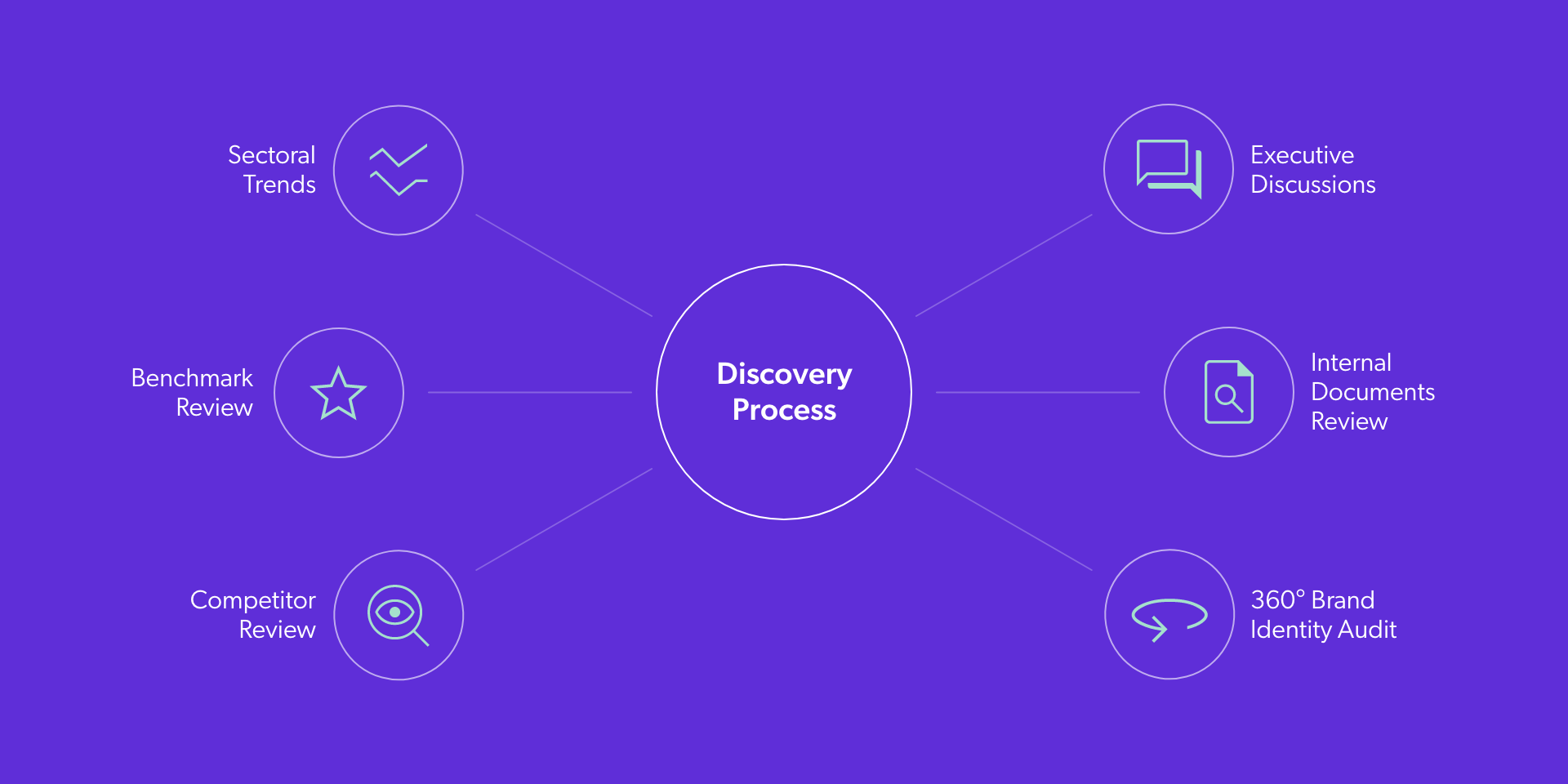
After our discovery process, we decided to leverage the global brand mark to maintain brand recognition. However, we would use language, colour and pattern to embed their bold attitude and strategy into the new brand.
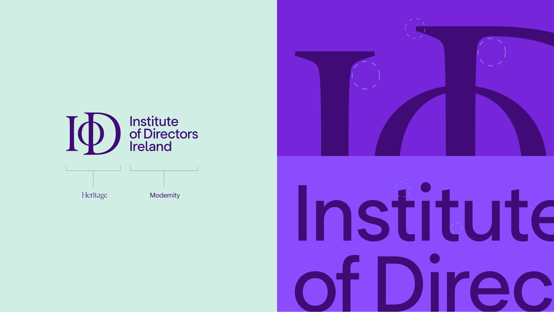
We retained the revised International IoD monogram and paired it with a modern sans serif typeface customised to align the style with the monogram’s iconic characteristics.

To define the brand style we started with three creative principles to guide our work.
Sophisticated
Simplicity
Simplicity is the ultimate mark of sophistication, and we needed a brand that reflected the standing and desired status of members.
Crystal
Clarity
We wanted to highlight IoD Ireland’s profound knowledge in a way that cut through for crystal clarity.
Relevant
and Relatable
To champion IoD Ireland’s member-focused attitude, we wanted to build a brand that uplifts, inspires and empowers members.
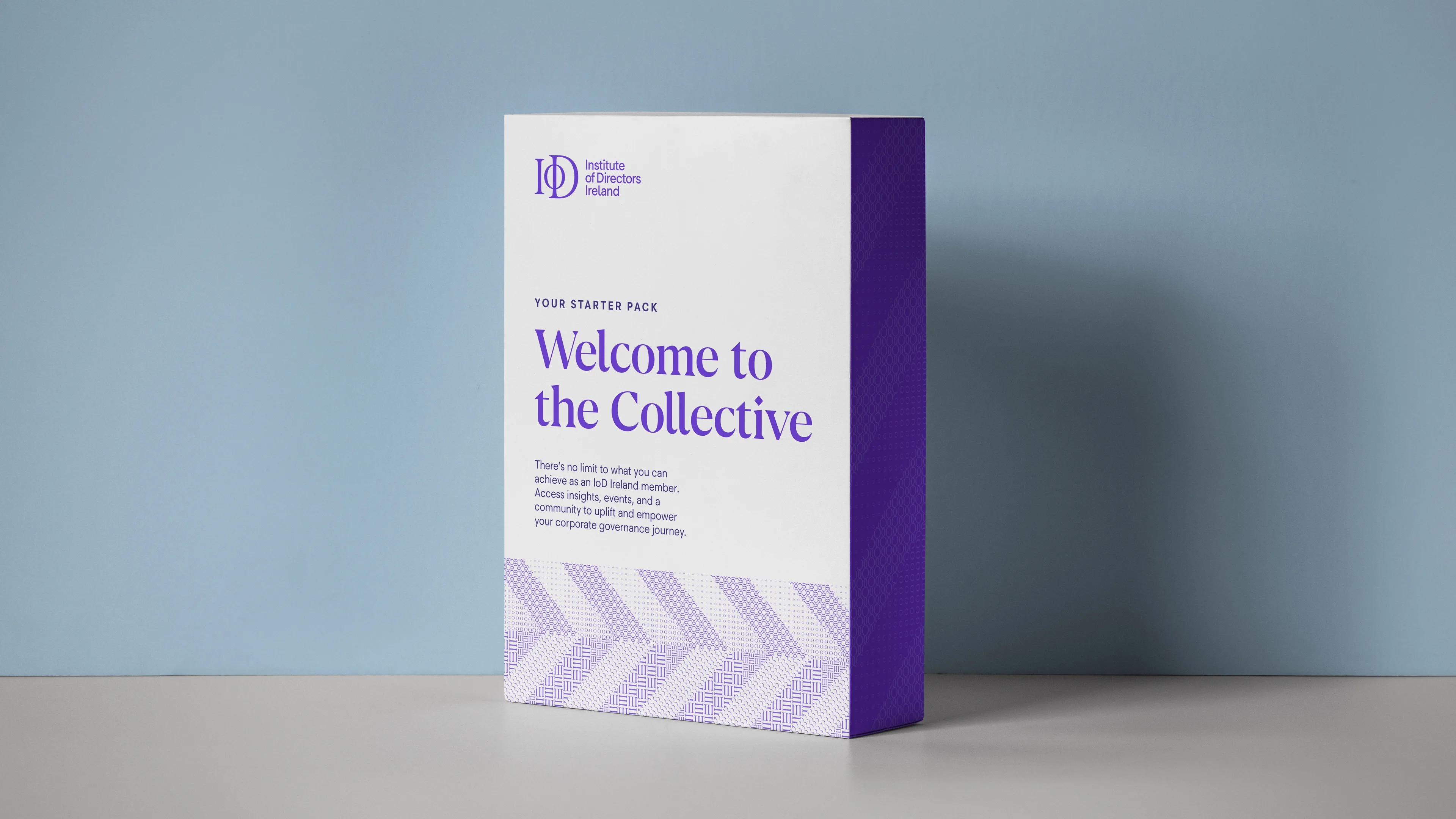
We designed a series of distinctive patterns grounded in the IoD Ireland CPD Framework.
Taking shapes from the IoD monogram and inspiration from luxury brands, we created an interlocking pattern that symbolises the dimensions of IoD’s competency framework. Each of the four patterns expresses a specific content type: structures and codes for technical knowledge and flexibility for the more human-focused side.
This update was important not only to create a cohesive look that would help members navigate courses with ease but also to symbolise the power of IoD’s collective strength.
Combining the four CPD patterns we created a master brand pattern designed to convey forward momentum and positive growth.
As the voice, resource and driving force behind leading business minds, IoD Ireland needed a tone that felt relatable, energetic and to the point. The goal was to create an iconic writing style that would resonate with everyone – from first-time founders to seasoned execs.
By distilling decades of knowledge into accessible content, IoD Ireland can now deliver informative insights that inspire and empower members to grow.


The new IoD Ireland brand identity is designed to better support, educate and connect thousands of pioneering directors shaping a dynamic future Ireland from the inside of business out.
