Meili
Rewriting the rules of mobility distribution
Developing the brand strategy and visual and verbal identity for the future of mobility distribution.
With the spirit of a disruptor and the expertise of a world leader, Meili needed a brand strategy that matched its ambition to relentlessly drive seamless mobility distribution by providing clarity across the customer experience for brands and consumers.

Challenge
Mobility distribution is at an inflection point. Over time, walls have been built between mobility brands and their customers, resulting in disconnected experiences where friction thrives. In a landscape where consumers are demanding better experiences, there is unparalleled loyalty to be won. Enter Meili, a tech company that enables mobility companies to integrate seamlessly with airlines, travel & technology partners, creating a friction free customer experience.
Our challenge was to create a brand strategy and visual identity that clarifies Meili’s unique role, differentiates them from the legacy aggregator model and amplifies how they empower the world’s leading businesses to drive greater insights, revenues, and ultimately success.
Solution
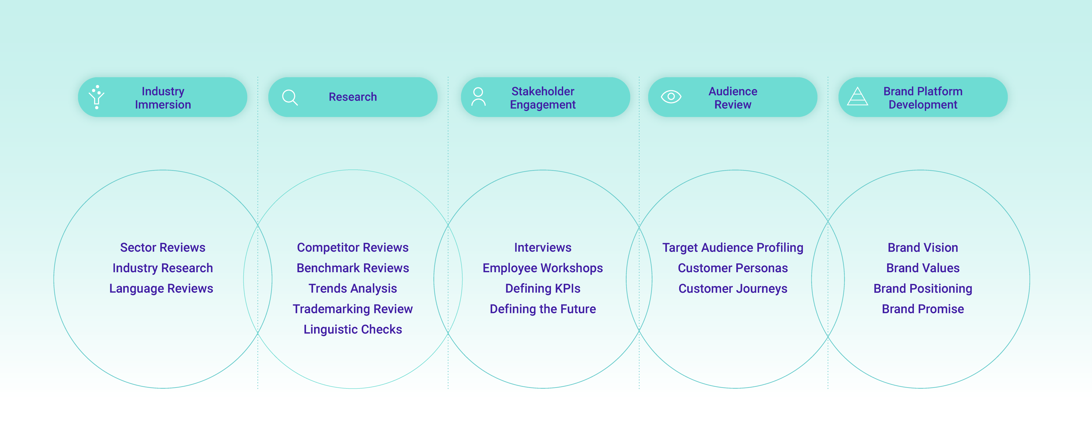
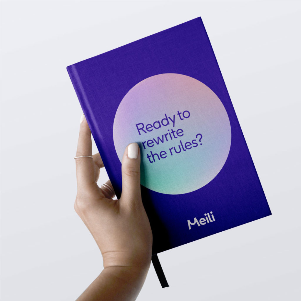
We began with a process of thorough research into the travel and mobility industries. This informed our approach to workshops with the Meili team, where we uncovered Meili’s ambition to rewrite the rules of mobility distribution. From here, we began to develop the brand strategy to guide the creative process, centred on the positioning of Rewriting the Rules.
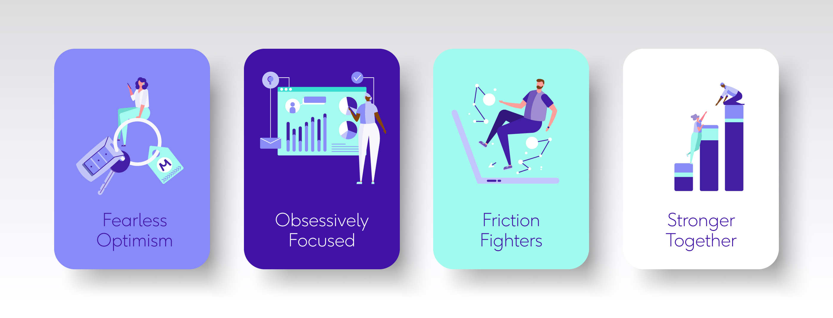
First, we crafted the values from the shared strengths the Meili team identified across the business. Fearless Optimism, Obsessively Focused, Friction Fighters and Stronger Together were shaped to form the foundations of Meili’s culture and work.
These strategic pillars helped us verbalise the future change Meili want to see in the world: their vision to become the most trusted mobility platform globally, moving millions of customers seamlessly. By uniting the brand under the new strategy, we could now bring it to life.
A bold verbal identity was defined based in the values that enables Meili to write with ambition. From here, we developed out the hero messaging for Meili’s launch to industry leaders around the areas where they win, from direct connection to customer experience, data, loyalty and more.
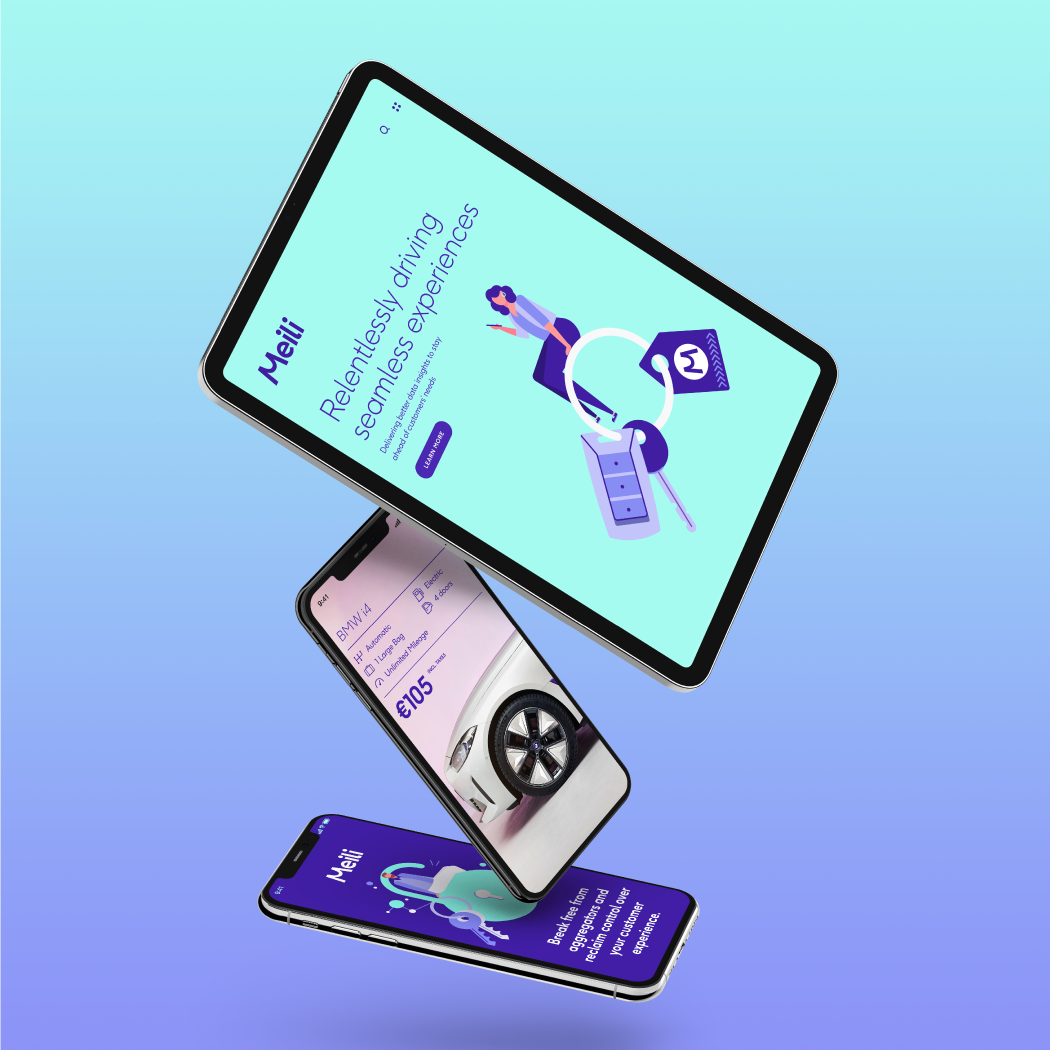
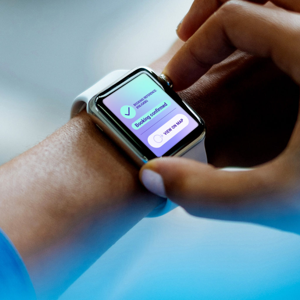
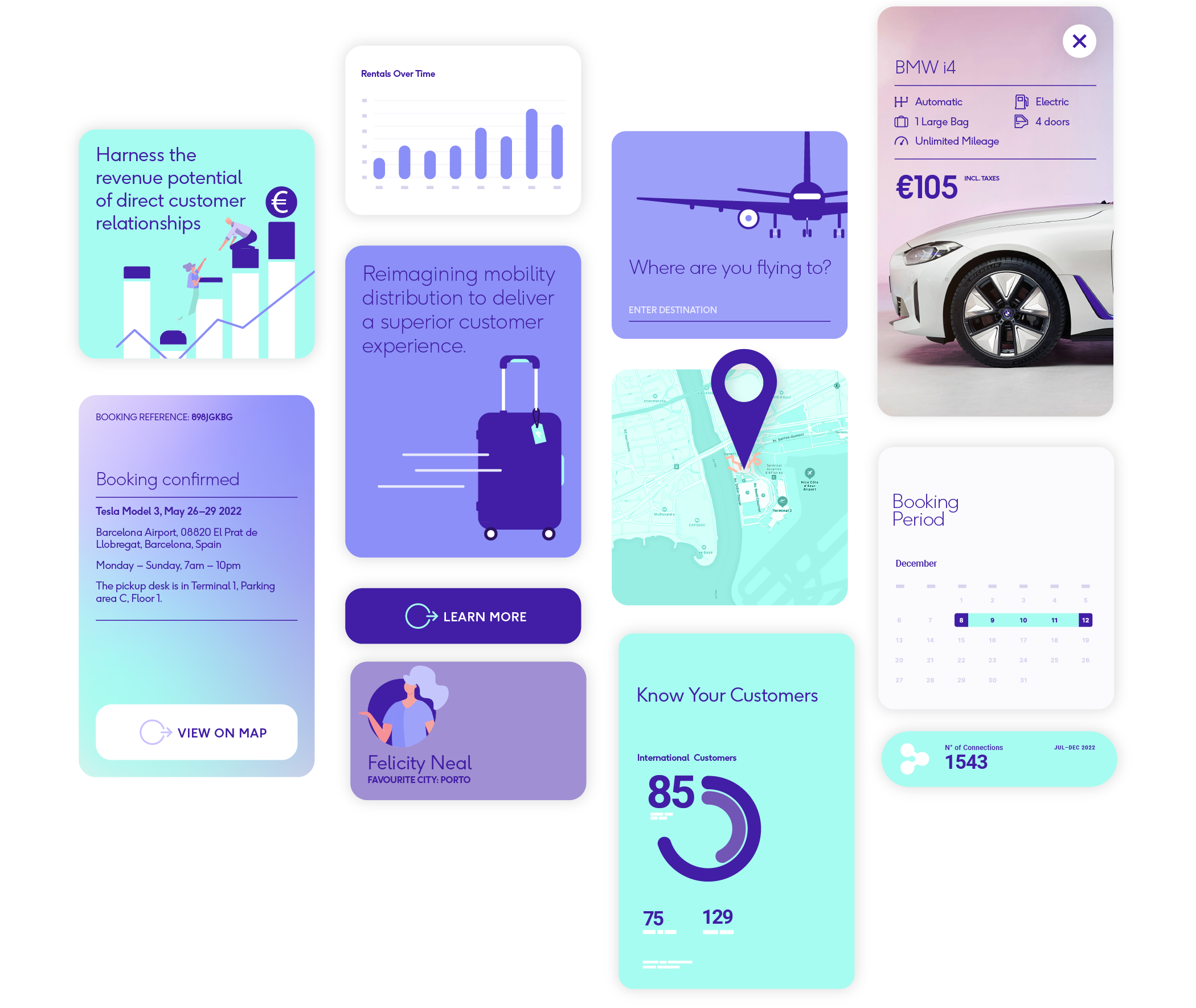
We also defined a visual identity built from the idea of transforming friction into flow. A fluid toolkit of elements was created aligned with the needs and ambitions of the brand.
The Meili logo is simple, clean and contemporary, featuring curves and swoops that represent the natural flow of movement and travel that Meili reinstates.
Working with RichardsDee has been a dream. Our goal was to develop the foundations of an exciting brand for a tech start-up, and I couldn’t be happier with the outcome. Everyone involved in our project team were absolute experts in their field and super helpful, both of which made the process seamless. They have a great work culture, and allowed us to engage collaboratively, which really helped the project to succeed. I’m looking forward to the future knowing that we will continue to work together, and excited to see what comes from that.
Laura Ryan, Head of Marketing, Meili
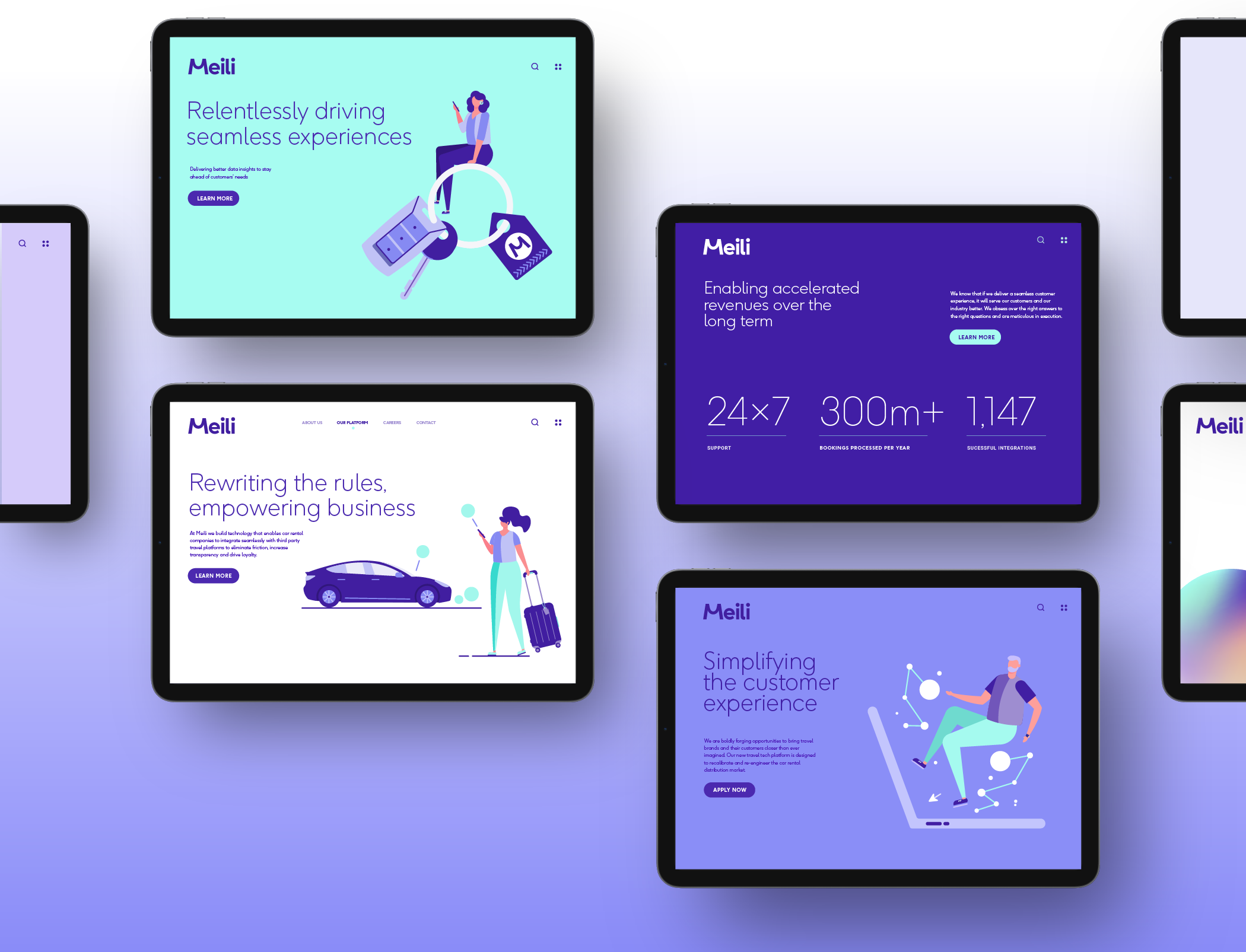

The sense of seamlessness extends into the colour palette, where we paired modern blues and greens with a sleek gradient to capture the frictionless flow of Meili’s platform.
Contemporary typefaces were chosen to optimise the brand for digital and align with their future-focused vision. With Ginger as the primary typeface and Roboto for UI elements allowing for flexibility across a broad range of communications.
Finally, a crisp, bespoke illustration style was designed to support the benefits of the platform and hero messaging. We took a human approach, creating an approachable yet controlled style that the customer can project themselves onto.