Uisce Éireann
Transformative water services
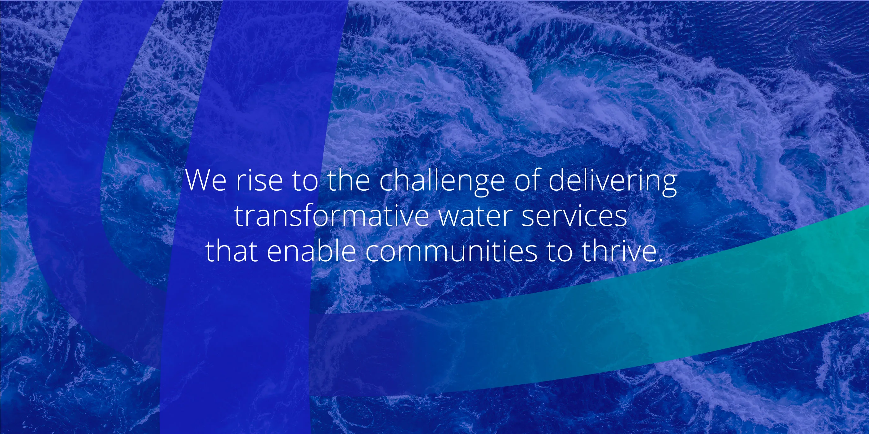
Creating a galvanising, fluid and unifying new brand system. One as vitalising as the services Uisce Éireann delivers.
Uisce Éireann is now the standalone publicly-owned utility with full responsibility for the delivery of public water and wastewater services. This monumental shift sees the bringing together of existing staff and colleagues from 31 Local Authority Water Services, to build a truly national organisation with a collective ambition – to be a world-class water utility rising to the challenge of delivering transformative water services that enable communities to thrive.
The challenge:
To reflect this transformation, the bringing together of teams across the island and a new 2030 strategy we partnered with Uisce Éireann to develop a powerful new vision and purpose. Our challenge was to create a compelling and cohesive approach with an authentic brand story at its heart – crafting core elements to anchor the evolved identity and do justice to the organisation’s new name and objectives.
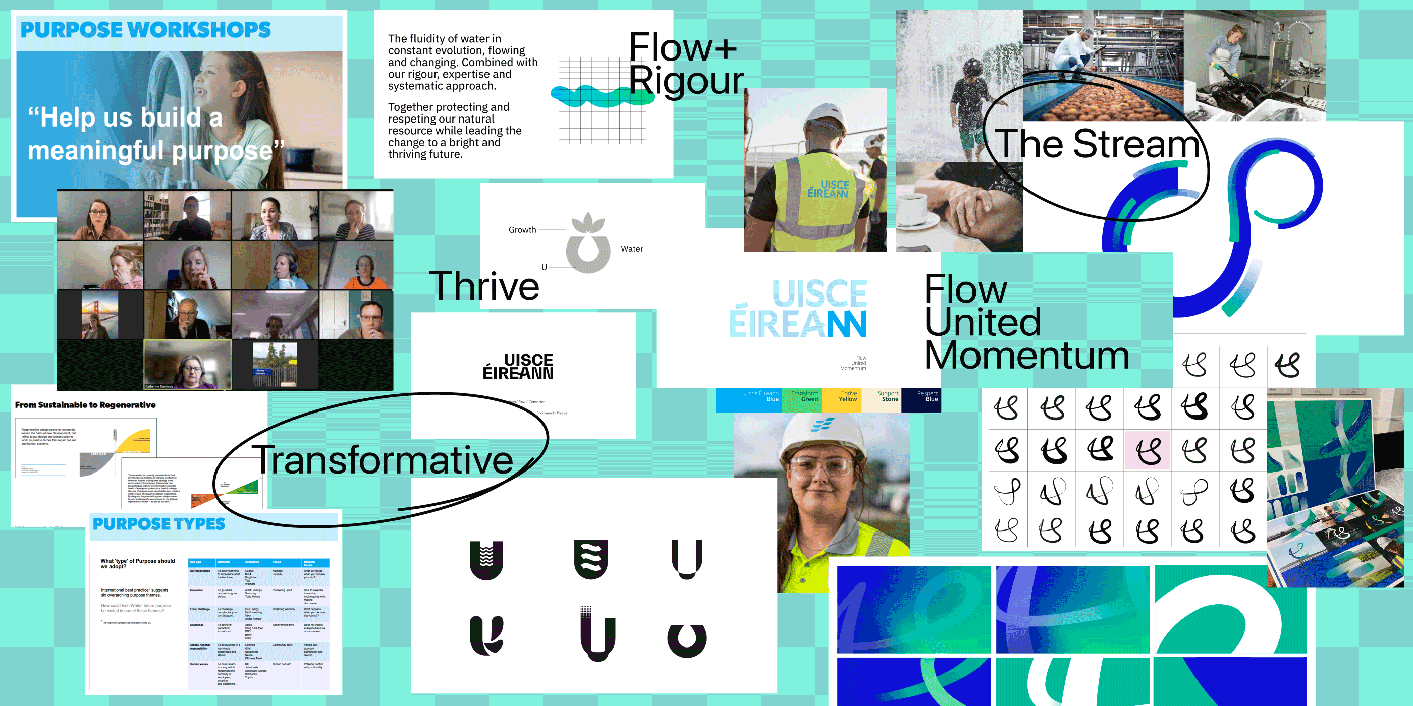
An illuminating exploration
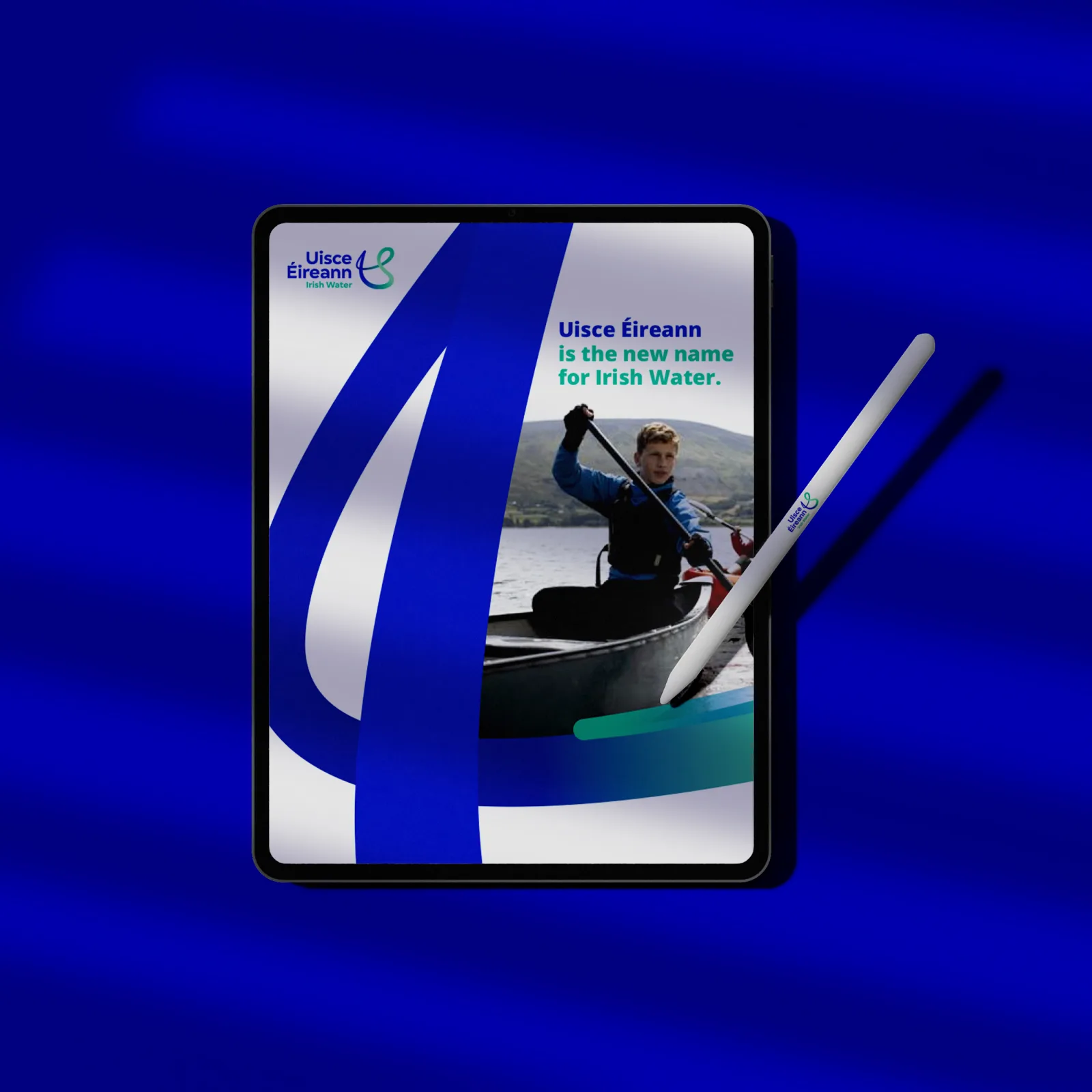
Our process had a wide scope. We explored all existing organisational research – from employee surveys to customer tracking. We analysed data from key stakeholders, consulted subject matter experts, audited the best-in-class utility benchmarks locally and internationally, delved into sectorial challenges and future trends, and undertook employee and executive workshops. The findings and insights enabled us to identify an inspiring territory and craft an invigorating new vision – one that speaks to Uisce Éireann’s many audiences and mirrors its future-focused aspiration; to help create a sustainable Ireland where water is respected and protected, for the planet and all the lives it supports.
A thriving purpose brought to life
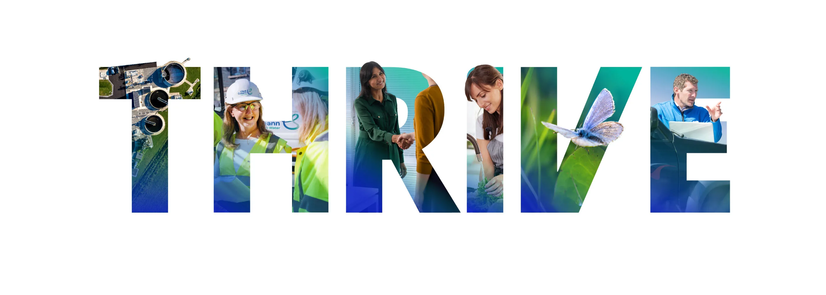
In collaboration with Uisce Éireann we created a new vision statement, purpose and proposition. A powerful trio of brand building blocks, here to inspire and anchor our brand assets and Uisce Éireann’s future actions. We created a new corporate strategy theme – THRIVE – an acronym to describe the organisation’s six new strategic ambitions.
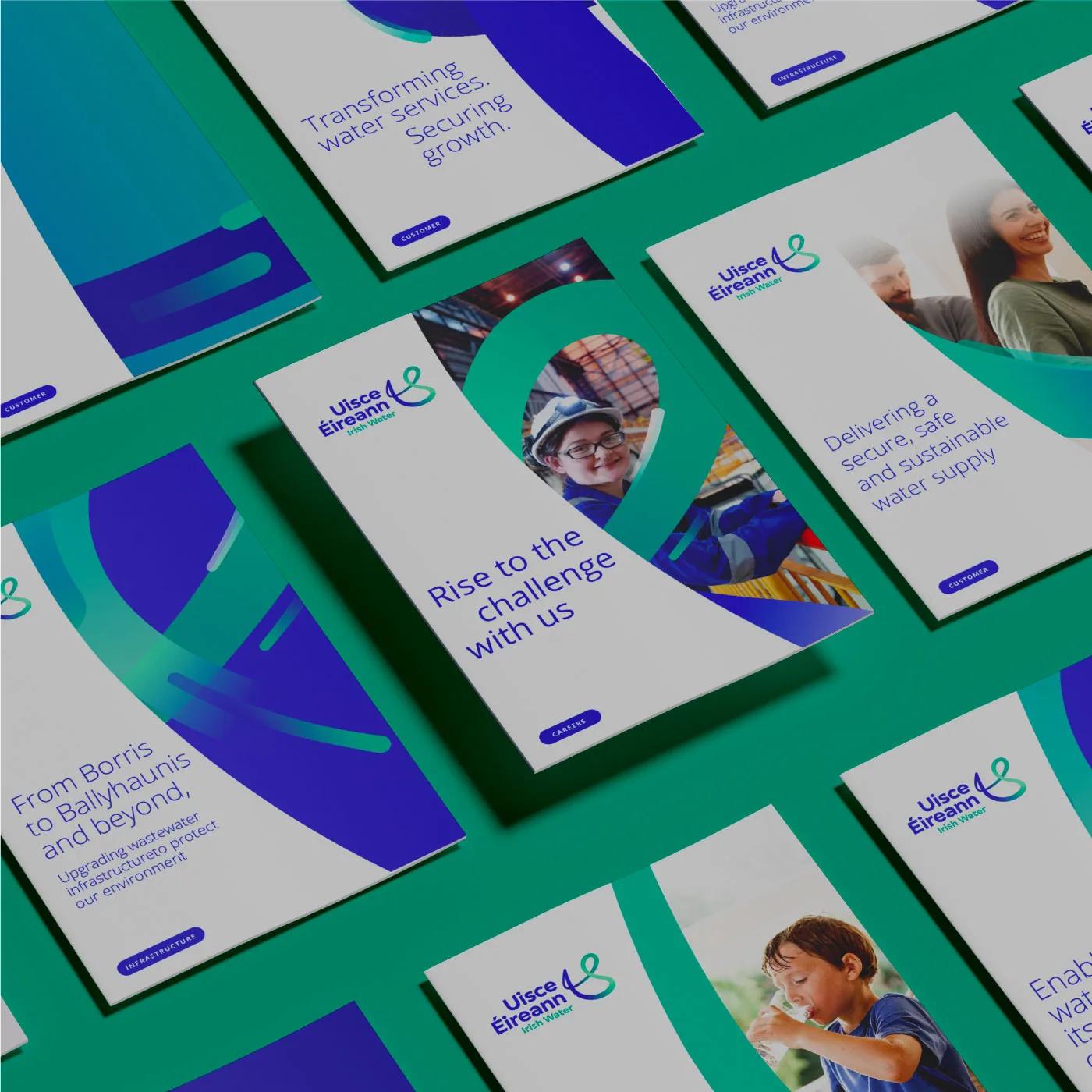
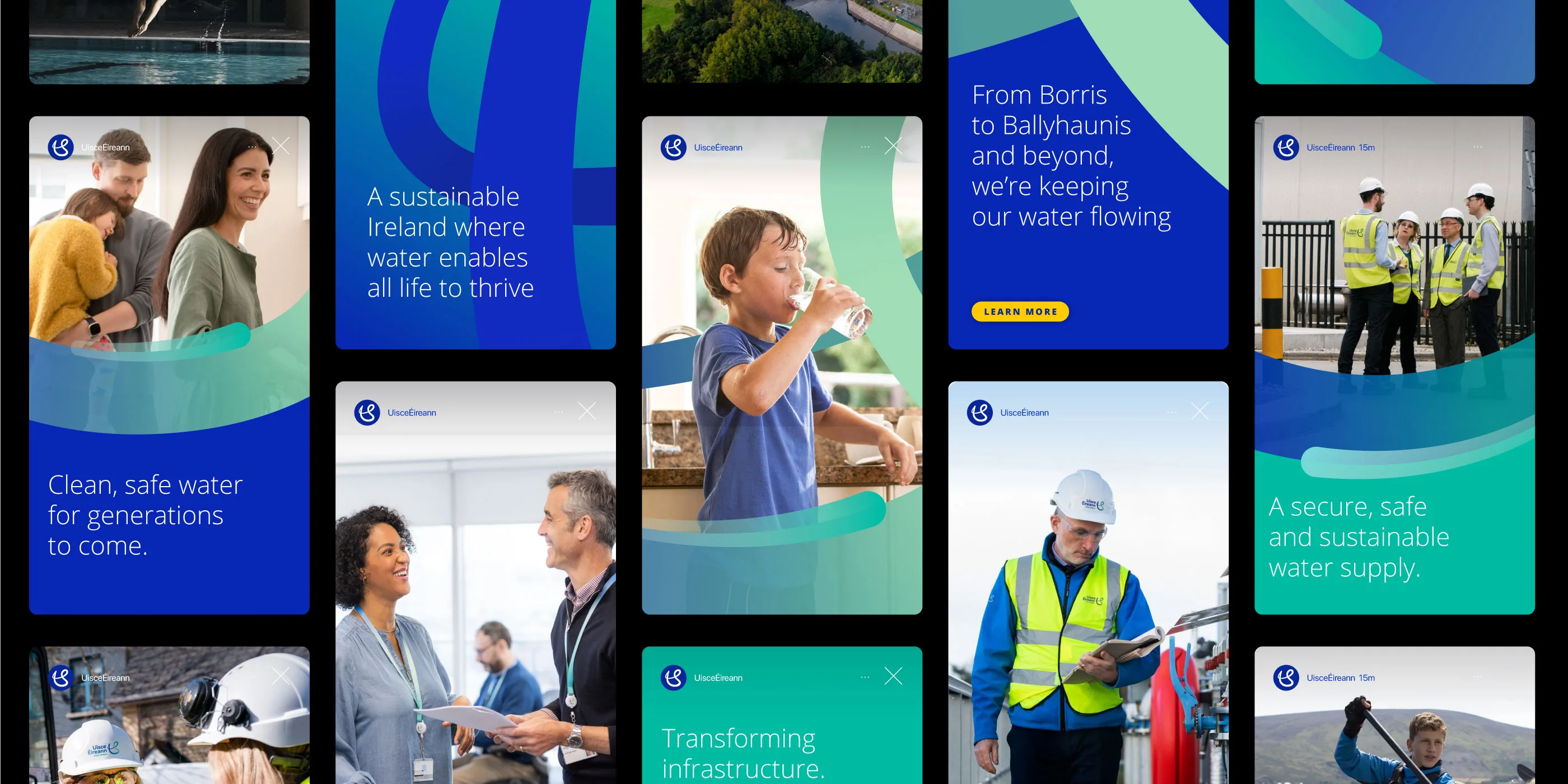
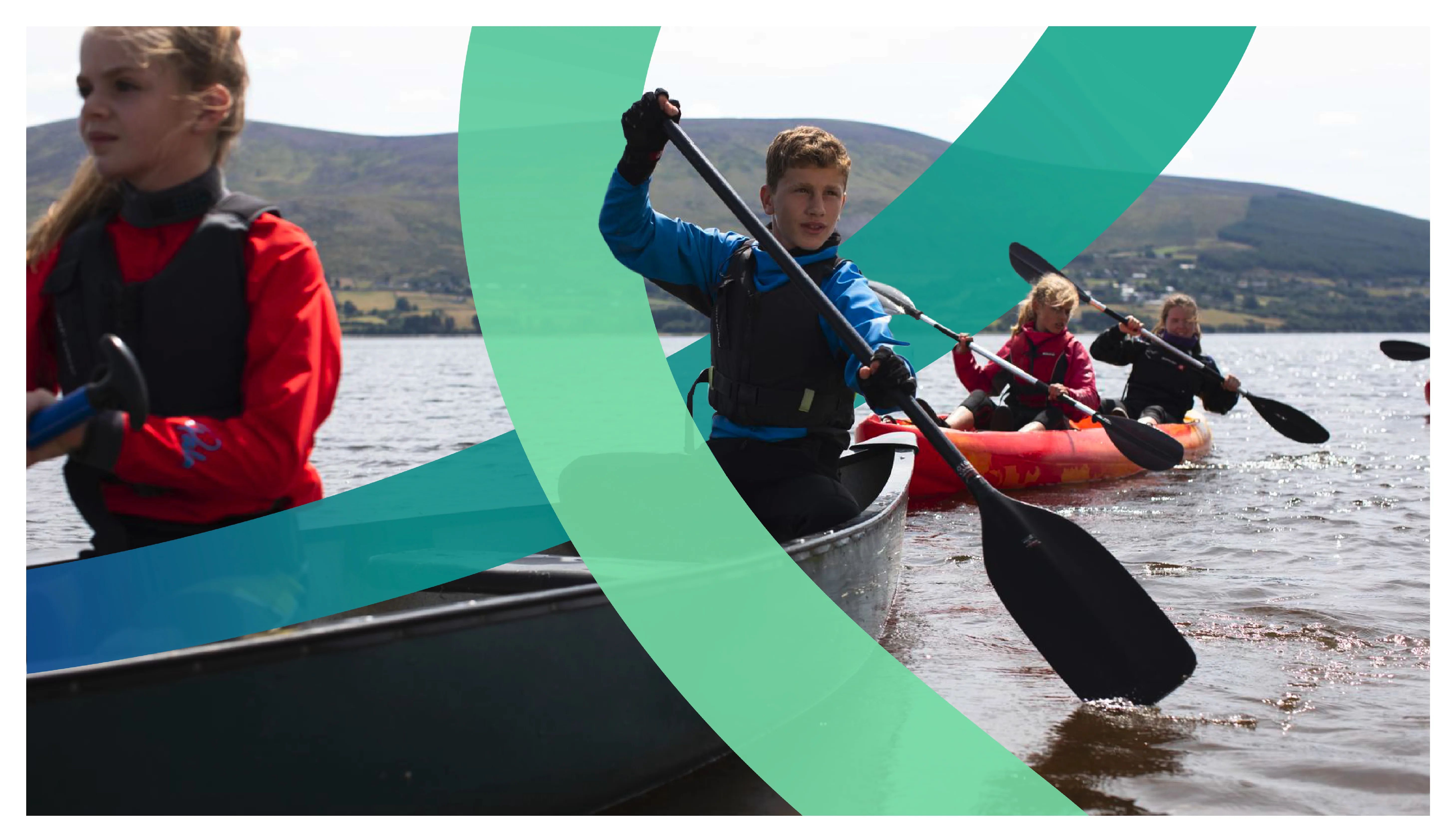
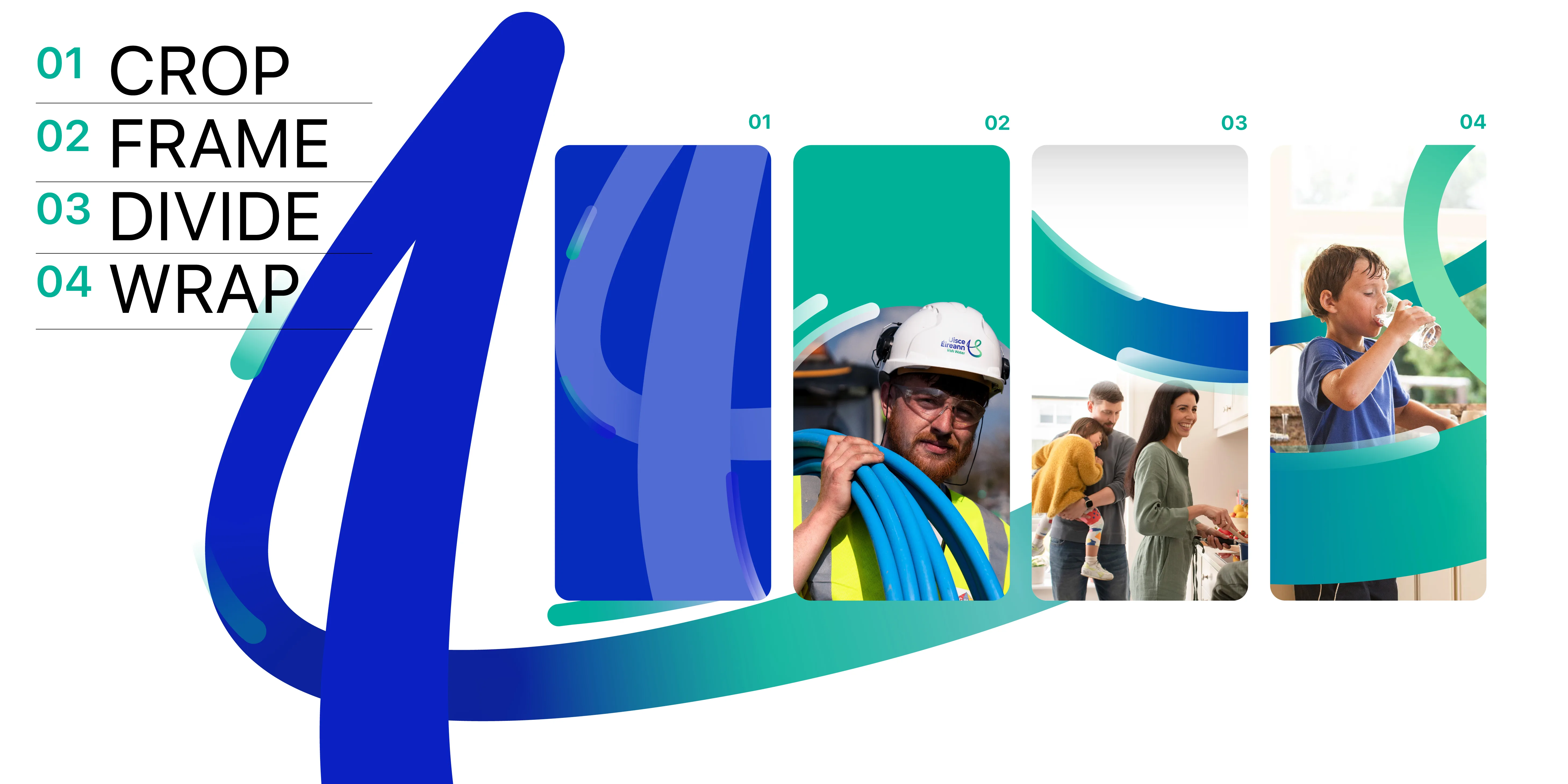
Next, we dreamt up and built out the brand identity. A forward-looking UE monogram was developed as a symbol of purpose. An identity with constantly evolving shapes and forms emerged – to best represent the dynamism and forward momentum of the new Uisce Éireann.
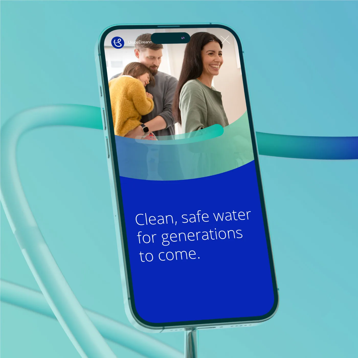
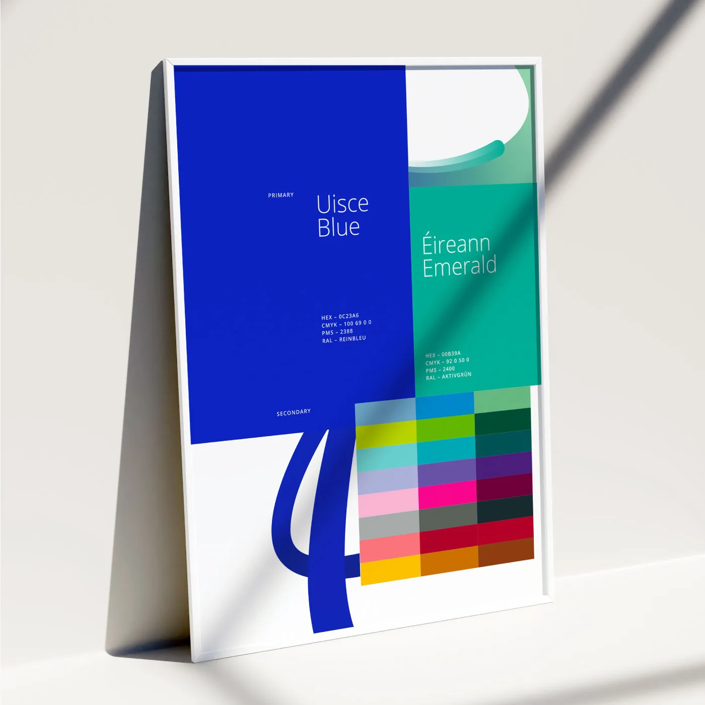
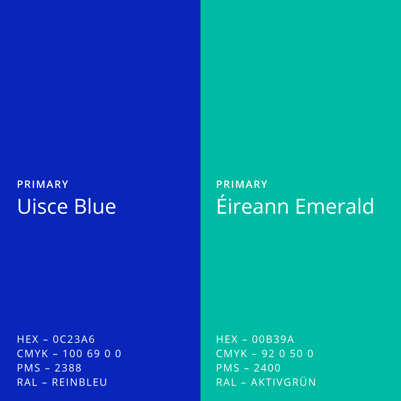
To bring further life to Uisce Éireann’s new identity, we created a dynamic colour system, using gradients to convey the brand’s transformative potential. We defined two primary colours, Uisce Blue to evoke nature, purity and water, and Éireann Emerald as a reflection of the organisation’s absolute commitment to a sustainable Ireland. Paired with white and a secondary palette of versatile colours, the palette is as vibrant as it is ownable.
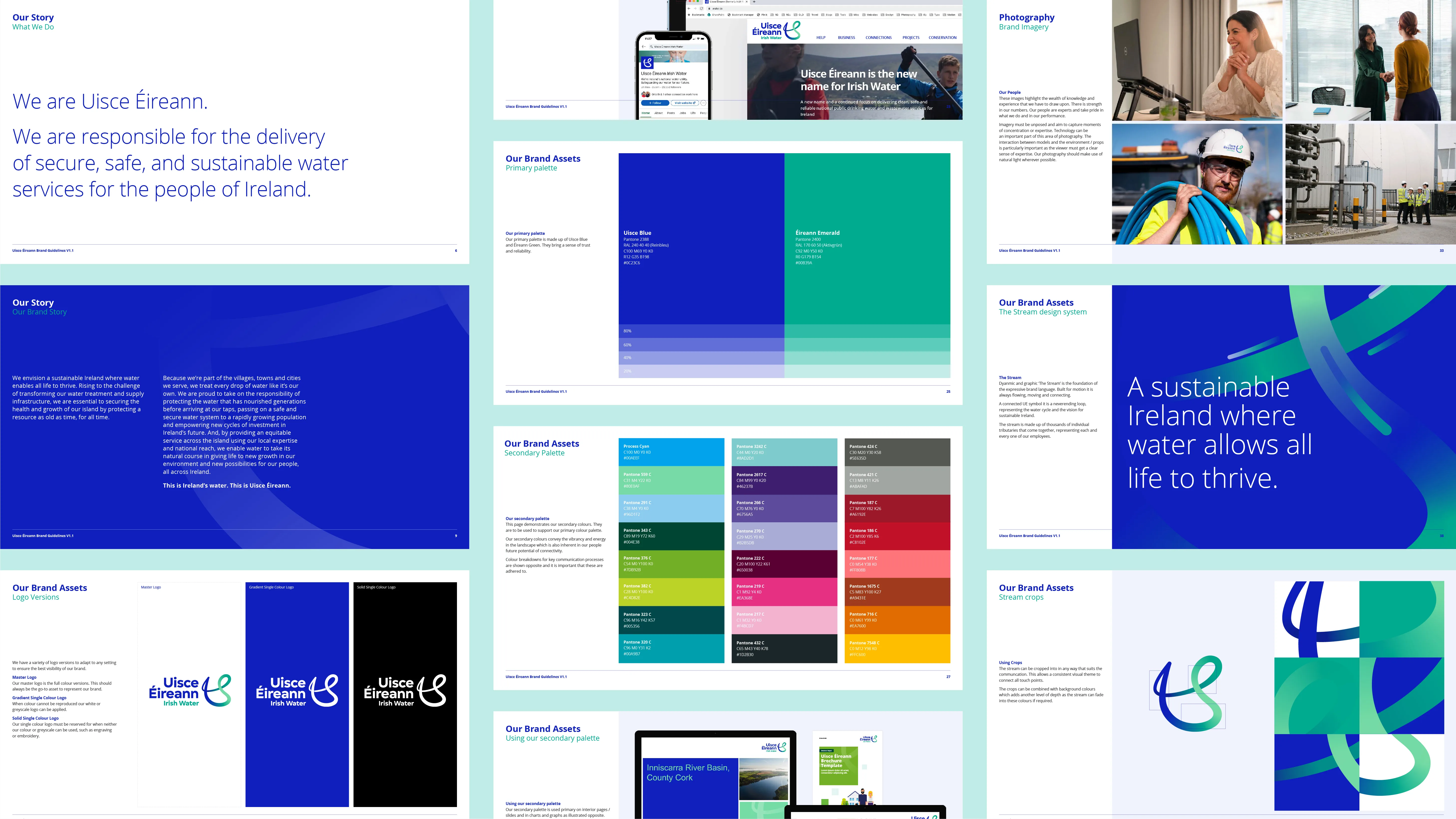
Finally, we developed the UE monogram into a vibrant graphic device named the ‘stream’. Created to reflect the concept of continuous sustainable transformation. The circularity of nature and the finite, preciousness of water as a resource.
The Result:
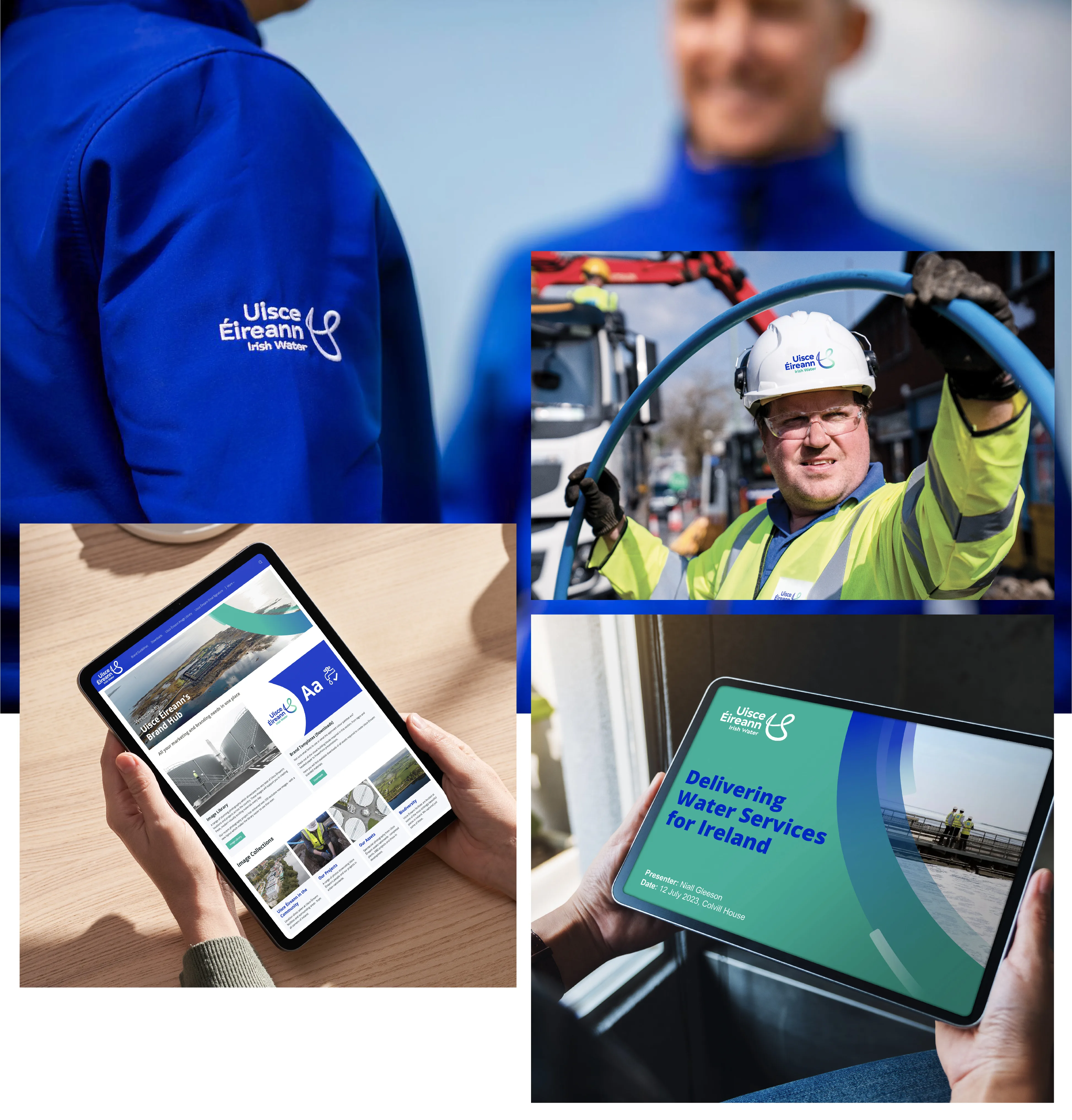
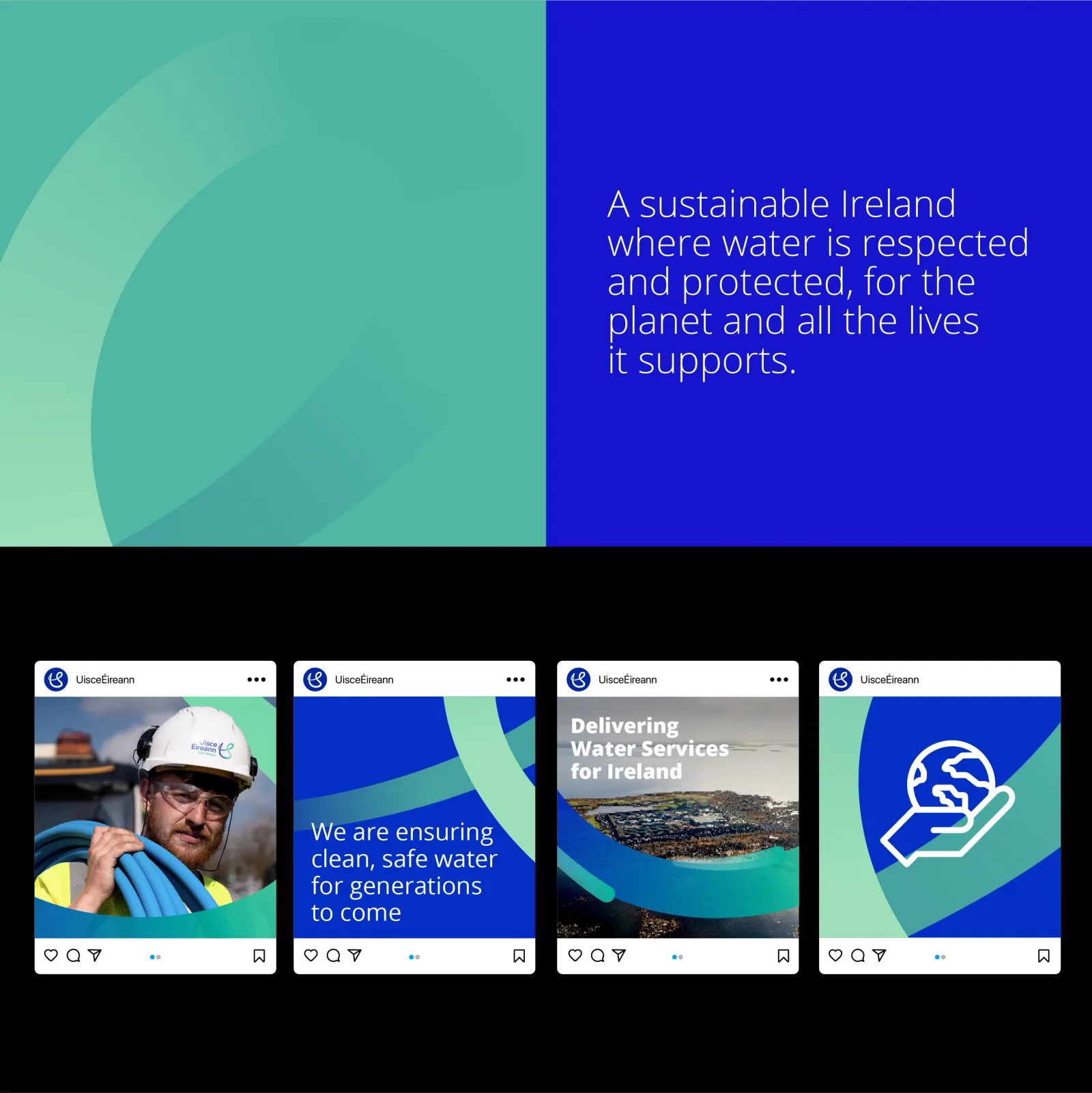
So far, over 100+ touchpoints have been rebranded with the new look and feel (across on-site signage, livery, customer communications and more) and it’s exciting to see this energetic and flexible system at work. Now that the identity has successfully launched, we are delighted to continue working with Uisce Éireann to embed the brand internally. After all, for any organisation to make a meaningful change to the world it must first empower its people.