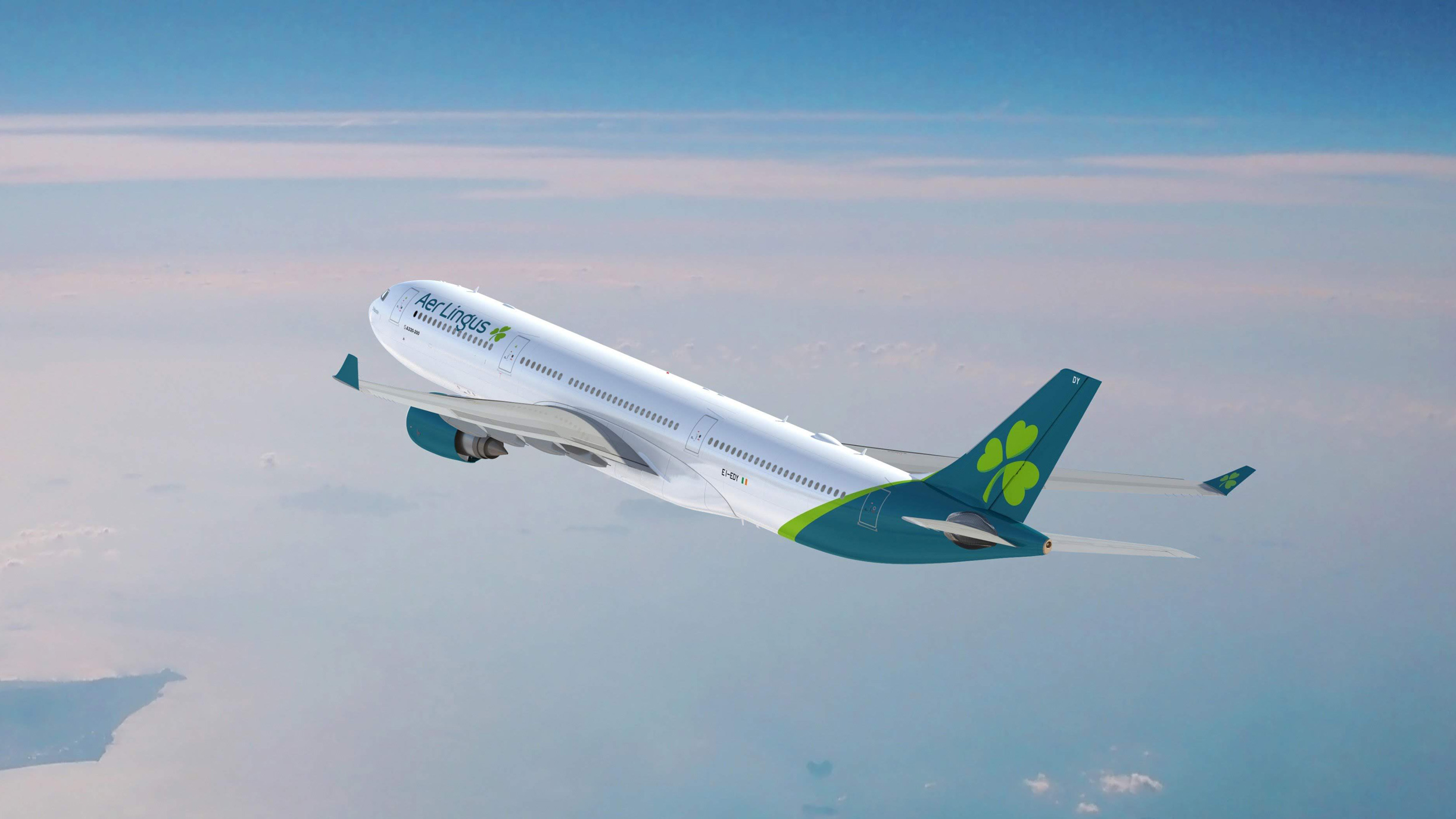
The Aer Lingus brand identity was in need of an update. Now twenty years later, Aer Lingus has embarked on a significant programme to overhaul its brand identity with a more “modern and fresh” image. In the past decade, the brand identity had transitioned from a dot.com sales logo to a well presented commercial brand. But it never recaptured the uniqueness, warmth and personality established in the rebrand completed 20 years ago – which was a benchmark in how an airline uses all experiences to reinforce a brands reputation.

Now the brand refresh has been launched how do we assess whether it is good or bad? At RichardsDee our viewpoint is that branding has to create meaningful change, helping brands adapt, motivate, grow and be the best that they can be. Great branding programmes start with real problems, real insights and a strong brand platform of vision, mission, purpose and personality, executed meaningfully across people, products, services and communications – a brand is what a brand does.
One problem that may have existed is getting to understand what Aer Lingus’s positioning was, the brand had been stuck between a value operator and a flagship carrier, trying to compete with Ryanair or position itself as a great flagship carrier like Swiss or Lufthansa. While the launch video explains the rationale, position and process, little has been written in the press about how the brand refresh will support the business case or assist in repositioning the airline, or how the brand experience will change in offering new products or services that will differentiate and motivate customer to chose them, rather than price. We do know that the new brand refresh is to reflect an international airline that connects, bring to life its value positioning and an airline that is in touch with modern Ireland.

In regard to the new brand refresh, there has been a lot of emphasis on the execution rather than how the brand is defining the future of how customers will experience Aer Lingus and how its reputation will be maintained. The shamrock takes centre stage, it retains its warmth and emphasises the hearts which is a good idea. The style elevates a consumer-centric carrier rather than a premium leader. The symbol features a 3D effect, but the shadow and depth of colour already looks dated, and when is a tilted shamrock not a shamrock falling over? Unfortunately, the brand refresh is lacking a bigger idea, the shamrock seems to be the idea and is placed everywhere and has become a shorthand to “an Irish welcome” even on the front of the door that is usually hidden? The font for the logotype brings a contemporary twist to the logotype, but the restyle ‘g’ does look awkward and unbalanced with the rest of the characters.
The new brand removes one of the brand most distinctive assets which is the heavy use of green on the livery. The new livery is lighter, modern, conventional and falls in line with fellow IAG stablemates Iberia, and maybe a potential design direction for Finnair and BA. Futurebrand’s rebrand of American Airlines created an ownable and dynamic retake on American symbolism without being overtly patriotic.

Overall it is and credible and consistent brand identity, it is true to its past but the refresh does little to communicate their values of strength and confidence, the refresh goes little further than addressing the cosmetic elements of the brand and helping the brand to look less like a national flag carrier and more accessible to a wider range of travellers. This was an opportunity to use the brand refresh as a principle to communicate clearly a focussed positioning, establish a leadership stance in introducing new innovative products and services and create a sense of purpose in the brand for the employees.

In contrast to this Alaskan Airlines went through a similar refresh by Hornall Anderson, but the launch established why, how and what the new brand will do for the business and customers. Alaskan Airlines grounded the refresh with research and in-depth conversations with flyers, they were clear in the goal the brand needed to make them look bigger, the brand became a lens to curate each travel touchpoint, they led with clarity in how the travel experience will become better including locally inspired food and craft beers. And, they went back to their roots, to the native artists in how their symbol of the Eskimo become modern, yet was respectful. The refresh wasn’t about revamping the identity is was making it relevant for “Today” – all supported by research to ensure that the refresh changed perceptions of the brand. 
Maybe, the real brand story is not about the shamrock, nor the brand refresh, but that Aer Lingus is moving away from a national flagship brand to positioning itself as a value operator with great connecting choice. Aer Lingus should be more than a brand that uses the shamrock as a shorthand, it is a brand where the warm, friendly welcome of Ireland runs through its people, and that the airline is an international player with Ireland at the centre – helping to connect and bring people together. If this is the case, then the discussion around the new brand ident should focus less on a stylised tilted shamrock and more on the positioning, the personality of the people in the brand and the progressiveness in how the brand will define the future experiences.
As commented in Totally Dublin.
Images may be subject to copyright.
