The Coaching Equation is an international professional coaching and mentoring consultancy that works with people at all levels to improve and transform their leadership and management skills. We were appointed develop an identity for The Coaching Equation that was approachable and modern, yet structured enough to support the proven methodologies employed to deliver results. It was important that the new identity reflected both the founder’s personality (positive and results driven) and style (classic with an edge), whilst positioning the company as a credible alternative to the primary competitive set who have advocated for very corporate identities.
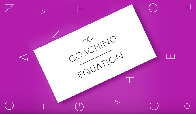
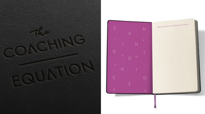
The Coaching Equation is about discovering each individual’s happiness / success formula. As every individual is different, The Coaching Equation takes a holistic approach to uncovering the right combination and balance for that individual. To that end, the central idea around the logo is the ‘Power of Balance’. A script font is used to add a personal touch, reinforcing the approachability of the consultants. The lettering in the main word mark has been manipulated to play on symbols derived from mathematical equations and primary shapes, and elevates the results-driven nature of the advice on offer. The divider line reinforces the idea of the ultimate success formula and plays to the holistic approach taken by the company when working with the individual (professional and personal, happiness and success). The result is an identity that is precise and to the point, but with a very distinct and differentiated personality.