RichardsDee shortlisted for FOUR Transform Awards

We are excited to announce that we have been shortlisted for FOUR Transform Europe Awards. The global brand development awards recognise creativity and strategic thought, and place real emphasis on the impact of the work.

“The calibre of submissions has been outstanding and this year has been very competitive. It is absolutely fantastic to see RichardsDee once more reach the shortlist in not just one, but four categories.”
Andrew Thomas, Transform

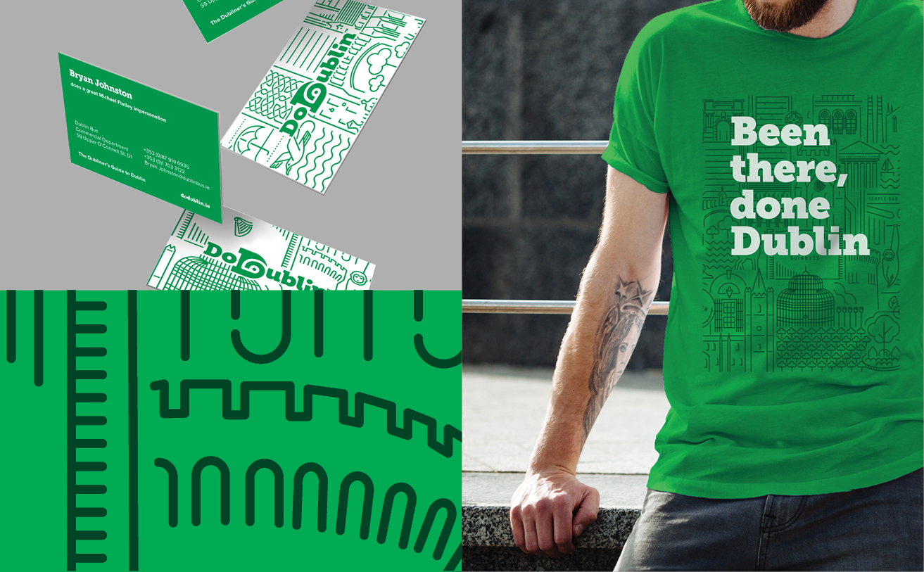
Our work with Dublin Bus on DoDublin has been shortlisted for Best Brand EvolutionBest Creative Strategy and Best Visual Identity in the Travel Leisure and Tourism Sector. Read the full case study here.


Our work with Bewley’s on Ireland’s Biggest Coffee Morning for hospice has been shortlisted for Best Visual Identity from a Charity, NGO or Not-For-Profit category. Read the full case study here.


“We are delighted to be shortlisted again for awards that recognise the transformative impact branding has on business, and industry. The Transform Awards are important awards for us for many reasons; a key one being the way their jury is structured by client side professionals who vote on commercial performance and disruption balanced with excellence in execution. This is our second consecutive year in the shortlist which is testament to the energy, focus and determination of both our own team and the clients who trust us with their brands”
Celine Dee, Co-Founder, RichardsDee


About Transform Awards

Transform is a publishing and events brand dedicated to the global rebranding and brand development industry. The Transform Awards celebrate the best in rebranding, employer brand strategy and brand development in Europe.

“Internationally, rebranding and brand development has become a catalyst for successful business. As opportunities ripen, this year’s Transform Awards Europe 2018 shortlist catalogues the leaps and bounds that brand development work is continuing to make. The shortlists quintessentially represent not only the impact of imagination, but also how creativity can elegantly meet strategy, thriving on nostalgia, mystery and striking imagery.”
Andrew Thomas, Transform

Socialise Presents: The Studio Edition

Socialise hosted their Studio Edition at the Sugar Club on Wednesday night and we were delighted to be one of the agencies invited to present. The line-up was all about nine – 9 of Dublin’s top branding and design studios with 9 minutes each to present.

With an audience of almost 200 people, we presented the work we have completed on the re-brand of Bewley’s, telling the story from initial brand strategy through to the development of the brands assets and applications – such as packaging. Seeing a full house of designers, brand agencies, creatives, etc. was, in itself, inspiring and exciting. Being able to share our work with Bewley’s was a great way to reflect on a project that started over three years ago and is still a work in progress.

Dublin Sightseeing Rebrand

Challenge

Dublin Sightseeing has a great product portfolio and a solid reputation for providing tours and travel services in and around Dublin. However, the market has become more competitive, audiences purchasing behaviours are changing, and Dublin Sightseeing’s image had become fragmented and did not reflect either the quality of the product or the level of experience provided. While known and identified as the Green Bus, the brand, its key point of difference and its portfolio of tours and associated services were not well known.

DoD_Image3DoD_Image4

Through a process of staff engagement, competitive benchmarking and customer research, we clearly identified and built on the strengths of the business and established the direction, which would lead to a more competitive and confident positioning and visual expression for the brand and its portfolio of products.

DoD_Image10

The challenge was to relook at the brand and how it engages with its many audiences, helping to grow market share, and regain its position as the “authentic Dublin” sightseeing company. We also needed to leverage the positive experience of the ‘Green bus city tour’ across the entire portfolio and clearly communicate the different tours and services on offer. An essential part of the process was ensuring that the brand and products were future proofed and could adapt to accommodate changes in technology, visitor expectations and possible category extensions, highlighting the need to challenge the naming and presentation of the brand.

DoD_Image_6
Insight

Aligning with Destination Brand Dublin, the two key audience segments for Dublin Sightseeing are the Social Energisers and Culturally Curious, who are seeking experiences that provide a real sense of place, along with an insightful and entertaining experience. It was important for us to show that Dublin Sightseeing is not a faceless multinational, but a team passionate and proud of their city and eager to share that with the world. Building on the company’s core USP – the best and most knowledgable drivers and guides in the city, and the inimitable Dublin personality, combined with our audience’s desire for fun, authentic experiences, we defined the positioning as “the Dubliners Guide to Dublin”.

DoD_Image6

The name of the brand needed to change to become more active, iconic and memorable – less about a generic sightseeing service, and more about what it can enable travellers to do. The name DoDublin emerged as a clear favourite from the naming process, and resonated well with local and international audiences when tested.

DoD_Image7

Opportunity

Our opportunity lay in creating a brand that could house a wide portfolio of distinct but related products that would be the authority on all transport and guided tours for national and international visitors alike. A confident masterbrand approach provides credibility, confidence and makes the most of all cross-selling opportunities, enabling the brand to maximise marketing efficiencies. It also establishes a brand architecture that is simple and strong, delivering impact and establishing a family style for all products.

DoD_Image8

The new identity created with Dublin, travel and sightseeing at its core – is visually represented by a ‘D’ with the symbol of an eye and a travel route combined.

Our tagline, ‘Don’t just sightsee, explore’ repositions DoDublin versus their competitors and speaks directly to visitors’ desire to get under the skin of the city they are visiting. The visual expression and messaging provides a distinct insight into the city, the culture and the people providing an experience that is real, unique and never scripted.