We are delighted that our friends at Switcher.ie have been acquired by Mediahuis. Our work with Switcher.ie to reposition, rename, and rebrand from U-Switch highlighted the importance of creating an accessible identity that embodied the company’s mission and unique positioning. Much like our collaborations with Openet, 4Site, Dubray, and TDS to name a few, this acquisition demonstrates the long-lasting value of a strong brand persona. Switcher director Carl Gaywood notes in the Independent “the quality of the Switcher platform and brand is truly outstanding”. Well done Switcher.ie on this achievement.
Tag: rebrand
11 brands we designed meaningful change for in 2021
2021 was an incredibly busy year in our studio. From new faces to new projects and group Teams calls to get-togethers, it’s fair to say there hasn’t been a dull moment. As the final few weeks of 2021 fade into a brand-new year with fresh surprises in store, we’re looking back on just some of the projects that we designed meaningful change for this year. And, if you have a strategy or branding project in mind for 2022, contact us at hello@richardsdee.com and you could find yourself on our list this time next year!
01 — Indigo
With Indigo Telecoms Group’s acquisition of our previous client 4site, we collaborated with the teams to define, design, and implement a strategic new brand built for the future of communication. By evolving the name to simply Indigo and the positioning to ‘Engineering a Digital Future’, as well as crafting an identity reflecting the new company’s three core offerings, a colour palette reflecting and complementing their name, a digital stream representing a future of limitless possibilities, and a brand voice and messaging deeply rooted in their core values, we helped set Indigo on their path to accelerating their growth strategy.
02 — Reitigh
2021 also saw us win new clients such as Reitigh, one of Ireland’s leading software companies solving the most complex processing challenges in financial services for banking, investment, and insurance enterprises. We worked closely with their leadership team to devise a unique set of values, a brand purpose, and a compelling promise as well as a strong design system and laser-focused messaging that brought their approach of ‘Always Simplifying’ to life. Plus, in the spirit of the festive season, we were even nominated for an ICAD Bell for our work! View more work here →
03 — Kerry
This year we helped Kerry look Beyond the Horizon with their stunning new pattern. Built in four layers to reflect Kerry’s From Food, For Food heritage, their strength in people, their unrivalled capacity for innovation, and their promise to reach over 2 billion people with sustainable nutrition solutions by 2030, the new hand-illustrated pattern brings their brand to life in miniature wherever it’s used. View more work here →
04 — MII
One of our biggest projects of 2021 was our rebrand of MII. Building on the brand strategy developed by Genesis, we delivered a revitalised visual and verbal identity system across the MII brand from the mark to a suite of impactful typefaces and the website to event naming. By amplifying MII’s role as the voice of authority for marketing in Ireland and an accelerator of marketing talent, we equipped the team with a brand that evokes their limitless ambition and radiates confidence. Read our full case study here →
05 — HOHR
2021 saw us appointed as Brand Partners to the Leadership team at the €1.6bn entrepreneurial powerhouse House of HR. Our challenge was to redevelop the Purpose, Vision, Mission and Values and crystalise these into a powerful creative strategy and identity system. Our solution was a rebellious and powerful system connected deeply to the brand we had defined previously, setting House of HR up for a bold and impactful future. Read our full case study here →.
06 — St. Vincent’s
For the third year running we produced St. Vincent’s Healthcare Group’s annual report. Designed around the theme of ‘Next Steps: Towards the Future of Healthcare’, we collaborated closely with the team at St. Vincent’s to deliver artwork and final layout for 2020’s report.
07 — Fáilte Ireland
2021 also saw us refresh the brand identity of Fáilte Ireland, Ireland’s national tourism authority. Building on the strength of the iconic shamrock, we imbued the revitalised logo with a sense of authority by reaching back to the classic identity born in the 1960s, as well as modernised the identity by refreshing the typeface, harmonising the colours with Fáilte Ireland’s regional brands, and reversing the mark from a negative shape (white) to a positive shape (green). Rich in storytelling, the new logo asserts Fáilte Ireland’s role as the trusted shaper of the tourism industry in Ireland. View more work here →
08 — Energia
2021 marked another busy year with one of our closest clients, Energia. As their longstanding brand partners, this year we collaborated on a range of exciting projects that unifies their brand experience across all channels and underpinning their mission. We have a number of interesting Energia projects on the go in our studio for 2022 in what will be a challenging start of the year for the energy sector.. View more work here →
09 — Irish Water
2021 also saw a stunning new photography project take off with our friends at Irish Water. Together, we embarked on a project to update Irish Water’s image bank to capture the scale and breadth of their investment in Ireland’s water infrastructure. In 11 days, across 28 locations around Ireland, we collaborated with photographer Keith Arkins to capture aerial and ground photography that visually evoked Irish Water’s national status from coast to coast.
10 — Childline
Just over a year ago, we won one of the most meaningful rebrands of 2021 – ISPCC Childline. Selected as brand partners to Ireland’s largest children’s charity, the past year saw us enter the worlds of children and ISPCC Childline teams across Ireland through workshops to discover how we could help ISPCC and their service Childline reclaim their roles as children’s advocates and allies. By crafting a visual and verbal identity deeply rooted in the vernacular of children while clarifying the relationship between the brands, ISPCC and Childline are established as the definitive destinations for resilience and support for generations of children to come.
11 — Studio Photoshoot
Earlier this year when we had the chance to safely – if briefly! – get back into the office, we took the opportunity to refresh our RichardsDee photography with the brilliant Josh Mulholland. Check out our sweet O’Connell Street space and the wonderful faces new and familiar that make it such a meaningful place to be. All it’s missing is a Christmas tree!
New brand identity for discoverireland.ie
Discover Ireland is the consumer-facing brand of Fáilte Ireland, Ireland’s Tourism Development Authority. This familiar household name and brand identity had been in existence for many years, but it was time for Discover Ireland to be brought up to date and better represent Ireland’s tourism today.
Our task was to deliver meaningful change by re-establishing Discover Ireland as the only online destination for visitors seeking authentic experiences. For this well-known brand, we needed to ensure it was relevant to a domestic audience, impactful and distinct in a world of travel and tourism logos, and carried Discover Ireland’s personality and warmth into the digital domain. This was the definitive digital offering for holidaymakers looking to plan every aspect of a break, and the new brand needed to represent this in a contemporary, confident, and trustworthy manner in order to grow numbers and awareness. The brand also had to work as a B2B brand, working with established trade partners as a recognised brand that they respected.
Through our process of discovery, definition, and design we established creative territories exploring how a logotype can retain its sense of place through symbolism – in contrast to modern online brands which amplify simplicity over personality. Our solution was to draw inspiration from traditional Celtic letterforms and combine their authenticity and charm with a contemporary sans font to deliver on the objective of a forward-looking personality. This was partnered with a colour palette building on the familiar language of green for Ireland, with a brightness that encapsulates the fresh final identity of discoverireland.ie, perfectly adapting across the digital world.
“Just want to say thanks to you and the team for your work on Discover Ireland. I love the simplicity and craft in the final version”
Niall Tracey
Director of Marketing, Fáilte Ireland
Cannes Young Lions: Part Two
The Work— Part 2, Competition Day
Inevitably, fresh-faced we were not, and at 5am we were up and at it again, ready to tackle the main day of the competition, the minuscule sleep adding some clarity to our thoughts from the previous night.
After raiding the local Starbucks at opening time of all of its coffee and croissants we made our way to the basement of The Palais. There we were shown to our booth and we moved into ‘production mode’.
Surprisingly, the day itself ran relatively smoothly (if we do say so ourselves!). We had devised a schedule and broken down the key targets we needed to hit to meet our 8 o’clock deadline, which proved very beneficial. Through the day we managed to stick to this, using it as a helpful guide if we felt we were spending too much time on any one element of the project.
At one point during the afternoon when the effects of the previous sleep-deprived night were setting in, a representative from Getty Images arrived at our booth with a camera person to ask us a few questions about how the project was developing and how we were feeling, ‘tired’ was our answer. But a few miniature pastries from the lunch table did the trick for a sugar-kick and we managed to push through to the finish line, with time spare to proof read and ensure our printed piece was correct.
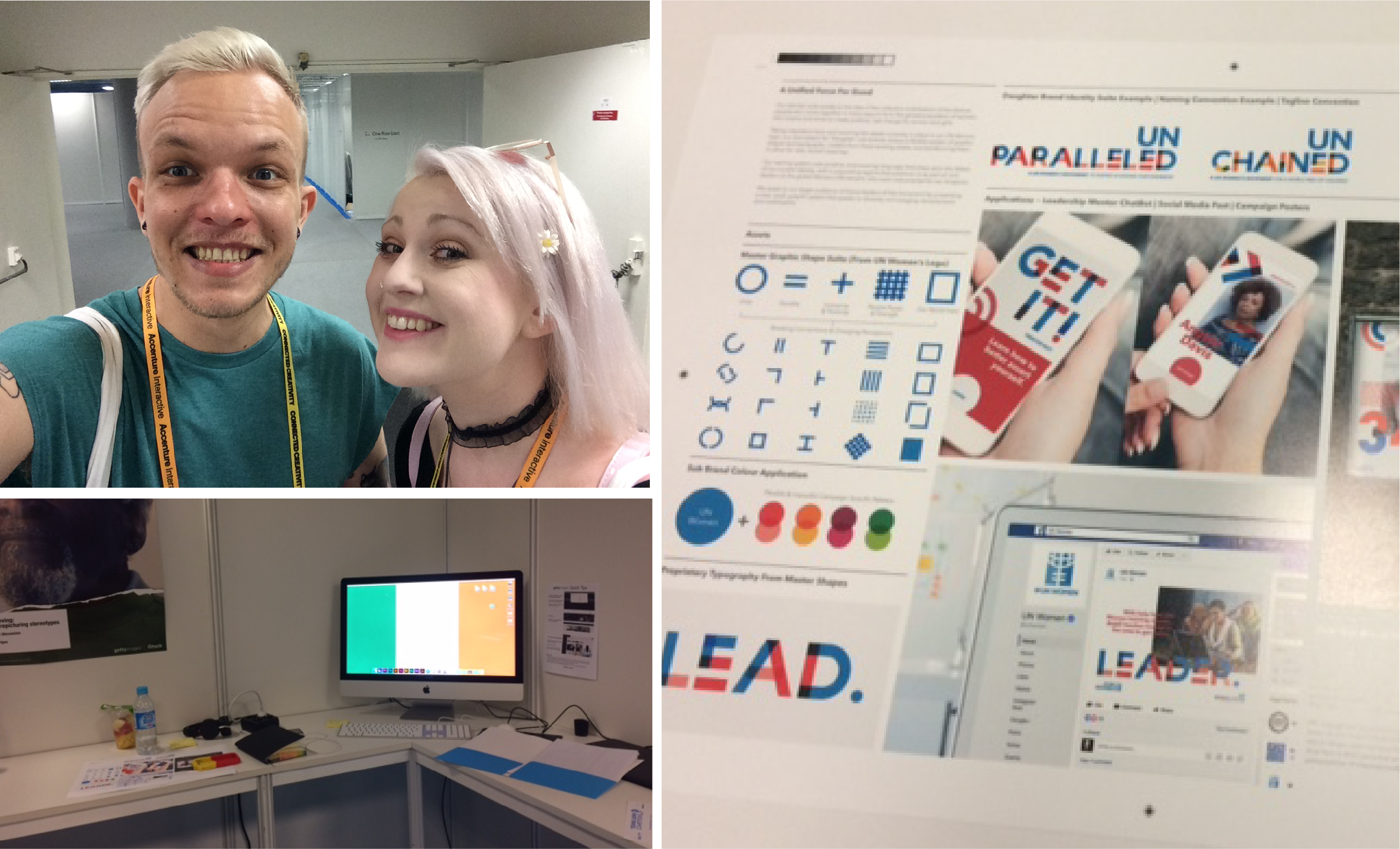
Our final design system revolved around the concept of ‘A Unified Force For Good’, speaking to the idea of the collective mobilisation of the diverse people who come together in many ways to form the global population of women, who inspire and strive to create positive, real change for women and girls.
Taking inspiration from and evolving the assets currently in place in the UN Women logo, our new system for ‘Daughter’ sub-brands utilised a flexible system of graphic shapes and typography, created from these existing assets, but transforming them to allow for the development of new forms, and varied meanings.
We did it! We were finished! We handed over the fruits of our labour, a single A3 document, and it was now out of our hands, ready to be presented to an impressive panel of judges from internationally renowned design agencies like Brand Union, Future Brand and Planeta to name but a few.
Time for an Aperol Spritz.
Another Aperol Spritz. Pizza. Sleep.
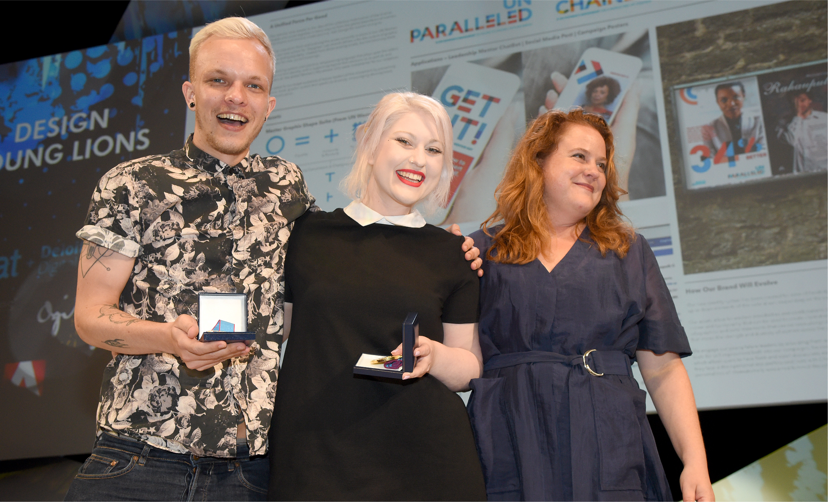
The Win
As an eternal pessimist (realist, OK?), I (Emma) had no inkling that we would be in with a chance of winning the much coveted Gold Young Lion. Kyle was more confident, hoping that we may place somewhere, possibly a bronze. As we sat in front of the panel of judges, IAPI representatives by our side, we suddenly got a wave of nausea over us as they announced the winners and we felt something we hadn’t admitted to ourselves all the way through the process…we really wanted this. Bronze was announced, not us. Silver, not us again, no chance. An then, to our utter disbelief the word ‘Ireland’ was called out as the winner of the Gold. The feeling that accompanied this disbelief was one of incredible euphoria, and immense pride that we had achieved this win while representing Ireland.
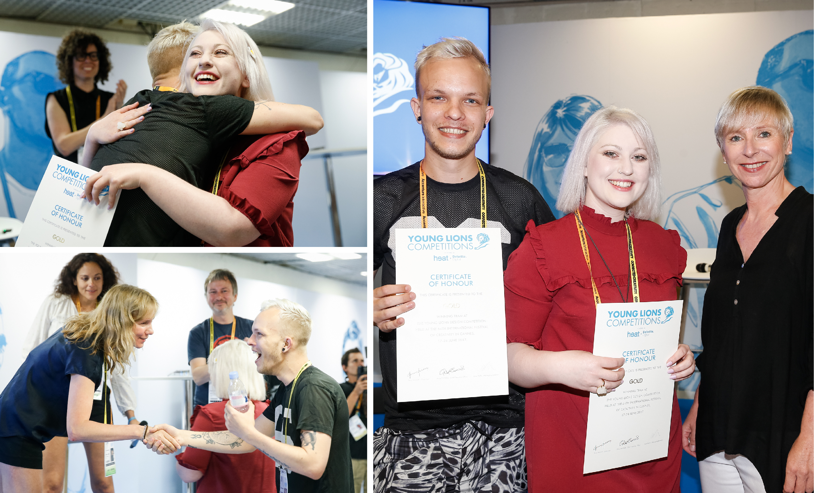
We thanked the judges, shook hands, hugged our teammates and the IAPI team, shed some tears, and most importantly…called our moms (and the RichardsDee Team)! The feeling was incredible.
We were photographed, interviewed and congratulated and then left to our own devices to get ourselves organised for the awards ceremony that evening where we would be awarded, alongside our peers and the judging panel, with two gold medals, on a stage worthy of The Oscars, in a theatre filled with over 1,500 people. No pressure, right? The awards show was fantastic, showcasing the inspiring work of the other Lion winners in the Design category.
Afterglow
As the first Irish Gold winner of Cannes Young Lions in its 23 year lifespan, we were very very proud. Young Lions has been a wonderful opportunity for us to hone our skills and push ourselves to the boundaries of what we’re capable of. It’s also been an unbelievable experience, being immersed in the festival environment and being surrounded by the world’s best creative talent, and with our other teammates form Team Ireland, in the beautiful location of Cannes. We urge anyone considering entering to just go for it.
We want to thank our wider team at RichardsDee without whom, none of this would have been possible, the external mentors we had along the way- Steve Payne and James Beveridge, and the team at IAPI who were an organisational powerhouse, supporting us all in Cannes, no mean feat!
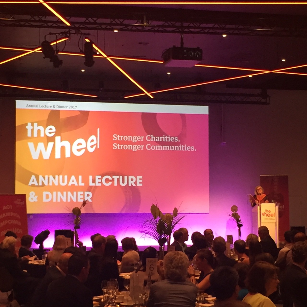
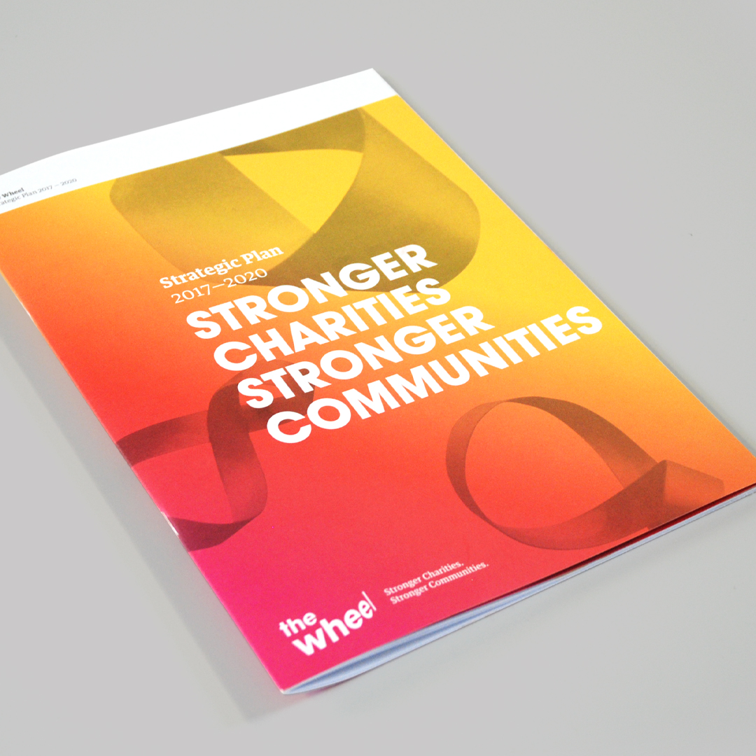
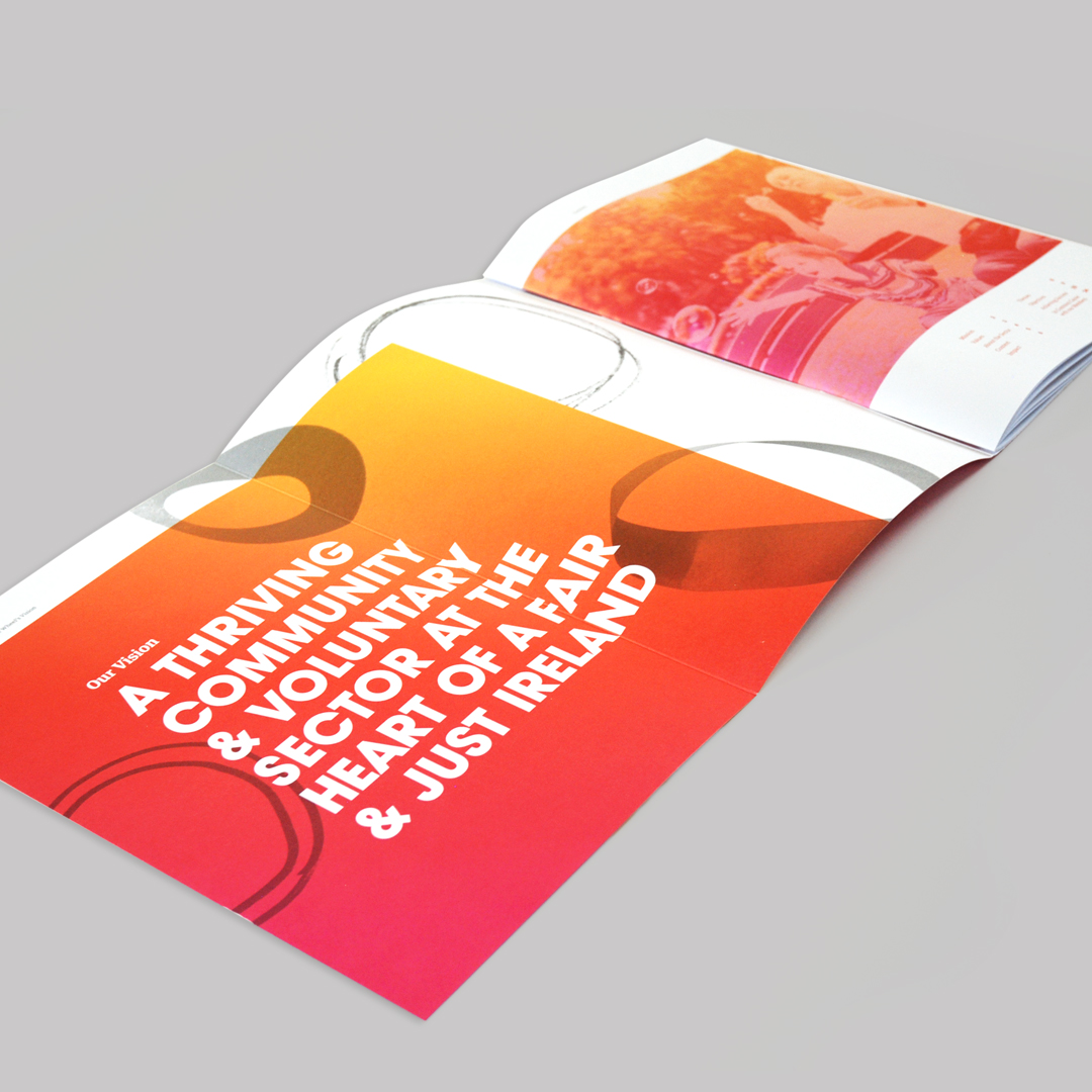
Reinventing The Wheel
We recently had the pleasure of attending the launch of the new brand identity for The Wheel at their Annual Lecture & Dinner, at Croke Park’s Conference Centre. The new brand identity- designed by our Young Lions Emma and Kyle- coincides with The Wheel’s new strategy document, “Stronger Charities. Stronger Communities.” which outlines their plan for action towards 2020. The evening was inspiring, with lectures from the inimitable Professor Tom Collins and members of The Wheel, beautiful music from the High Hopes Choir and education around the challenges facing the sector disguised as a fun table quiz!

The new brand hinges itself on the active citizenship that The Wheel encourages and strives to create in society, with the concepts of people power, diversity, inclusivity and progression at its core.
Socialise Presents: The Studio Edition
Socialise hosted their Studio Edition at the Sugar Club on Wednesday night and we were delighted to be one of the agencies invited to present. The line-up was all about nine – 9 of Dublin’s top branding and design studios with 9 minutes each to present.
With an audience of almost 200 people, we presented the work we have completed on the re-brand of Bewley’s, telling the story from initial brand strategy through to the development of the brands assets and applications – such as packaging. Seeing a full house of designers, brand agencies, creatives, etc. was, in itself, inspiring and exciting. Being able to share our work with Bewley’s was a great way to reflect on a project that started over three years ago and is still a work in progress.
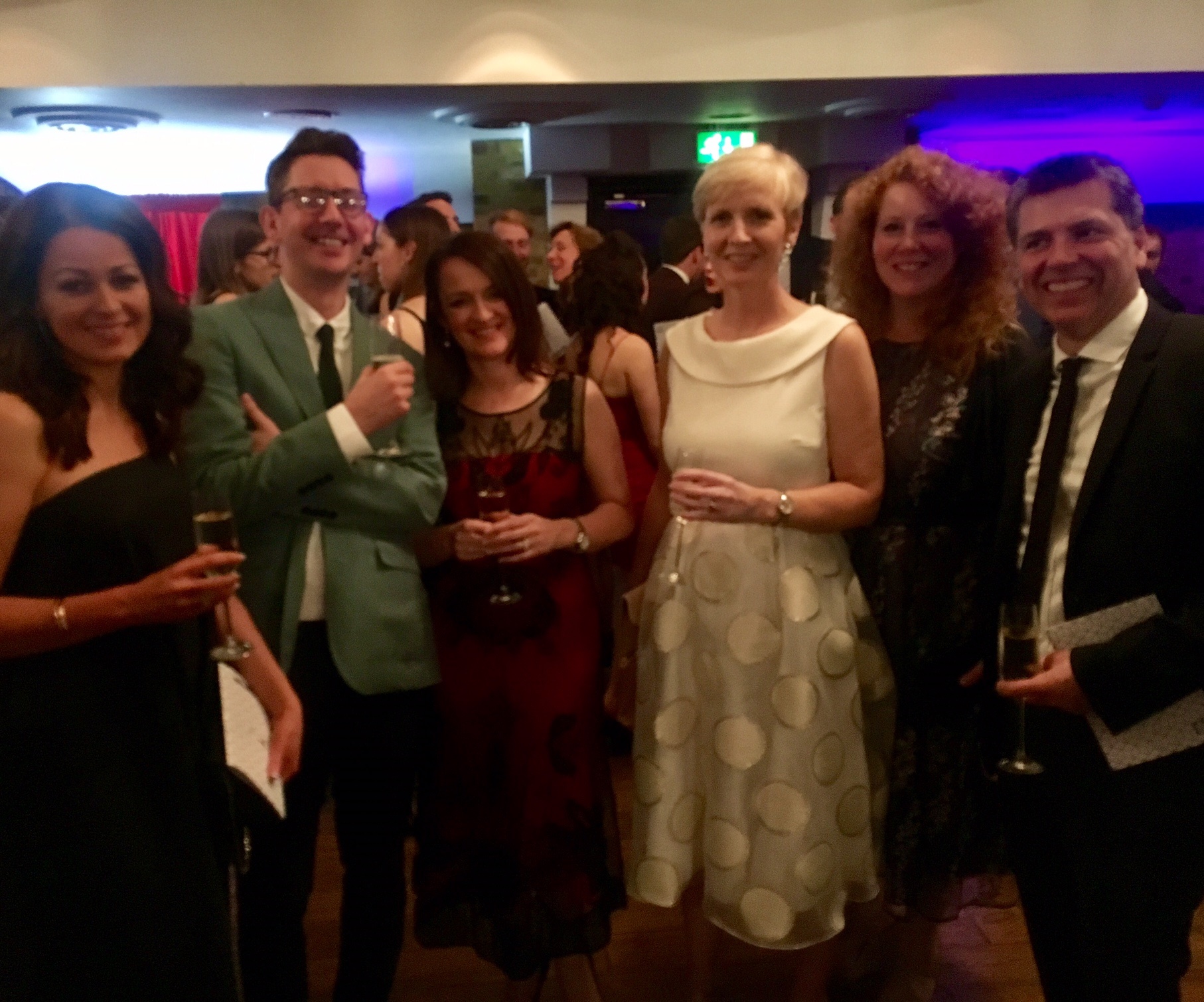
RichardsDee wins at the Transform Awards Europe 2017
RichardsDee’s work on the rebrand of Bord na Móna was awarded Bronze at the eighth annual Transform Awards Europe. RichardsDee’s excellence in rebranding and brand development was recognised in a room of global branding agencies. With fierce competition, the calibre of entries broke all previous awards records, with a 35% increase in both the companies entering and the actual number of entries.

Established in 2009, the Transform Awards has evolved into a celebration of the indispensable talent that exists in international branding. Covering Asia-Pacific, the Middle East, North America and Europe, the Transform brand itself is truly global, with no other outlet as committed to providing such comprehensive coverage of the brand environment. The awards recognise the creativity and strategic thought exercised and provide the opportunity to celebrate with clients and colleagues at the most prestigious awards event for brand communications.
‘The Transform Awards evaluate exemplary work in brand development, and acknowledge the growing significance of brand in strategic corporate communications. Developing and sustaining a strong brand is imperative for success and we are honoured that our work with the brand team at Bord na Móna has been recognised on an international stage’
-Celine Dee, RichardsDee
The awards ceremony, hosted by comedian and actor Russell Kane, was held at the Brewery, in Moorgate, London.
“Each brand that has been involved in this year’s awards, global or local, has demonstrated outstanding creative ability and strategic thought while working closely and collaborating with their agencies.”
-Andrew Thomas, Transform Europe Awards